Robyn Ness
Posts tagged with User Research in Blog Tiny Studies
Showing 1 - 10 of 29 items
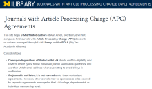
As part of the process to launch a new library application that helps U-M researchers and authors at our three campuses locate publications covered under institutional open access agreements, usability testing was critical to the successful development of a usable, sustainable tool.
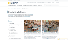
Find a Study Space is a brand new feature on the library website that launched in August 2025, improving our existing study space content and providing students with a new way to explore library study spaces. Learn about our research and design process and some of the key findings we discovered that informed the final product.

What are the main characteristics of search queries submitted from the “What can we help you find” search in the lib.umich.edu homepage, and how relevant are results in our U-M Library Search “Everything” results? Learn how our small team gathered, categorized, and analyzed queries, and their results to reveal trends and insights from search query behaviors that will help us improve people’s experience finding promising materials in the Library.

In April 2023, the U-M Library opened a newly renovated floor, the Clark Commons, on the 3rd floor of the Shapiro Library. During the first year the Clark Commons was open (April 2023-May 2024), we collected a number of data points to assess whether the design goals for the public spaces on the floor were being met and to try to capture use trends. Throughout this initiative, a combination of qualitative and quantitative methods were used to capture both attitudinal and behavioral data in order to document lessons learned from this renovation that could be applied during future renovations.

This blog post explores the challenges faced by novice users of the University of Michigan's Library Search interface, drawing on user research conducted with undergraduate students and librarians. The research aimed to understand how students approach library searches, to identify their pain points, and learn how they navigate the Everything results page. By gaining insights into these areas, the research aimed to identify opportunities for improvement and inform the design of more user-friendly library search tools.

This blog post reflects on the learning experience I had as a novice user research (UX) intern at the U-M Library. Through this nurturing and eye-opening experience, I enhanced my understanding of research operation, the activities which support the user research conducted by library employees in the Design & Discovery unit of the library.
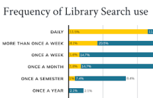
The U-M Library UX + Design Team conducted a benchmark survey in late 2022 aiming to understand people’s experience with Library Search. Objectives included measuring user satisfaction, identifying audience needs, and comparing results with Harvard University’s survey using the same methodology. Survey findings guided the development of the Library Search Product Statement as well as user centered improvements such as implementing LibKey Direct-to-PDF API, and refining catalog results filters.
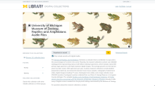
For the past year, U-M Library Digital Collections have been undergoing some big design changes. This blog post tells the story of launching and evaluating the usability of collections containing a new type of media: audio and moving images (AMI). In a research study consisting of a heuristic evaluation and 50 usability tests with a diverse group of users, the team uncovered over 20 mostly minor usability issues, recommended improvements to the interface that will be implemented in 2024 and beyond, and learned a lot about the complexity of library products along the way.
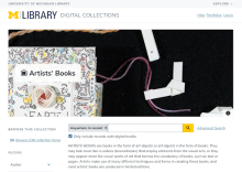
User research is best performed as an iterative process, where each round of testing provides valuable insights to lead to the next stage of development. The recent uplift on the University of Michigan Library’s Image Digital Collections offers a prime example of iterative user research, as it included testing phases for early mockups, plug-in image viewers, and an interactive coded version of the site. By continuously testing, we were able to identify potential issues early and to refine the site to better meet user needs.
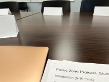
In Fall 2022, the Library Environments department began a pilot of two designated “zoned” spaces in response to user feedback asking for more information about what to expect from a study space. We conducted focus groups and integrated participatory design to learn about how users are perceiving and experiencing these labeled spaces.