User research is best performed as an iterative process, where each round provides valuable insights to lead to the next stage of development. By continuously testing, teams can identify potential issues early and refine the user interface, navigation, and overall experience to meet user needs. The recent uplift on U-M Library’s Image Digital Collections is a prime example of iterative research, done over time and with targeted research focuses, to aid in feature prioritization decisions and inform future development.
A bit of background -- in 2022 we refreshed the look and feel of our image digital collections after nearly a decade. Take a look at one of my favorite collections, Artists’ Books. as an example of this new design. Because the interface uses the U-M Library Design System, it bears a strong resemblance to the U-M Library Website and other recently updated systems, like Account and Library Blogs. In addition to following the well-tested styles laid out in the design system, a lot of stakeholder review and user testing has gone into the new site to make it easier to orient within a collection, view detail in individual images, and search within a collection.
You can learn more about the “why” and the “what” of this interface refresh in this blog post from April 2022. Let’s delve into the user research behind the new design.
Concept Testing
In Autumn 2021, before anything was coded as a working website, I began testing on interactive mockups using a prototyping tool called Figma with assistance from two interns from the U-M School of Information, Annika Gidley and Yoojin Choi. The guiding purpose of this round of testing was users’ search behavior and ability to navigate within a single collection, and to identify which U-M Library or other partners held the physical items in the collection and could answer questions about the collection. We also explored what a top-level landing page for all collections might include, although that design is not yet released because our many digital collections formats currently share a landing page and are still undergoing their own interface refreshes.
From testing with nine participants, we learned that they weren’t always certain which collection they were viewing. In response, the design was modified to more clearly label the collections by moving the title to overlay the banner image instead of appearing lower on the page. We also found that the initial position of the search-within-this-collection box immediately above results filtering options unintentionally implied a connection between those functions. In later versions the search box was positioned apart from the sidebar and filters, which also gave a larger area for text entry. Additional findings related to how participants preferred to browse or search, which were features not fully available yet in the uncoded mockup.
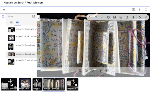
Image Viewer Testing
In addition to testing our early concepts with users, we also had a round of usability testing devoted solely to image viewer plugins in order to choose one consistent viewer instead of continuing the practice of having each collection decide on a viewer independently. The image viewer plugin is what allows you to zoom in and out and manipulate the digital images in collections in order to study them in detail. My colleagues Ben Howell, Larissa Stenzel, and our intern Tess Mendes performed testing using other institutions’ sites that incorporated different viewers, such as Harvard University Library and the New York Public Library.
Through this research, we selected the Mirador viewer because it performed the best with participants across a range of tasks requiring image interaction. The research team tracked time to complete tasks as well as success rate. Some factors contributing to the Mirador interface’s ease of use were controls grouped in one location in the image viewer, good color contrast, and clear text labels for control icons and image titles.
Coded Prototypes
By winter 2022, a small number of collections were available for preview as coded sites with almost fully interactive features. For this round of testing, intern Annika Gidley and I explored how participants interacted with search and browse features and our own implementation of Mirador, which weren’t testable during the previous mockup testing. Interactive behaviors are often difficult to test in a mockup because you would have to predict or script a path in order to build pages, rather than relying on the coded site to do its thing.
We found many of our previous choices validated, including much appreciation from participants for the Mirador viewer and overall look and feel of the site. However, testing also uncovered a range of small points of confusion for users. When viewing collection home pages, several participants did not notice the browse option, a valuable feature in image-based collections where visually scanning is often a faster method for locating a desired item than typing keywords. In later designs, an icon was added to call attention to this feature, along with icons for some other components such as collection titles. When interacting with search results, a checkbox labeled “Has digital media” was unclear to participants and became “Only include records with digital media.” Additionally, the labeling of “Start Over” on the search results page was made less ambiguous as “Clear Search.”
The Next Iteration
As our digital collections platform continues to evolve, we will continue to perform usability testing to understand how users interact with digital content. In fact, Emma Brown and interns Suvi Hirawat and Ruikun Wang recently performed testing that included both the image digital collections and our brand new Audio and Moving Image (AMI) digital collections, such as the Hazen Schumacher’s Jazz Revisited Radio Show collection (login required), which share many design components. Although the findings are not yet ready to share, we look forward to incorporating what we learn from that round of user feedback into future updates to the user experience.