Background
For the past year, the interface for U-M Library Digital Collections has been undergoing some big design changes. Image collections were the first group of digital collections to receive a makeover, or as we call it, an uplift, and were the first to be evaluated with user research. You can read about the research for image collections in this blog post from October 2023. The next digital collections in line for an interface uplift were audio and moving image (AMI) collections, which include two new collections containing audio files that were not previously supported. These collections are Hazen Schumacher’s Jazz Revisited Radio Show (login required) and University of Michigan Museum of Zoology Reptiles and Amphibians Audio Files.
These collection interfaces were created using the general layout of the image collection interface, but required some changes to display the content of audio and video files. The user research team’s job was to evaluate the usability of those changes for a wide range of users in order to recommend improvements as needed, and to investigate some existing issues that the Digital Collections team had noticed across all uplifted collections.
What We Did
UX Intern Suviksha Hirawat and I consulted with the Digital Collections team to identify untested parts of the new interface and issues they encountered after launching the uplifted image collections.
We conducted a heuristic evaluation of the new interface to further uncover potential usability issues using Nielsen Norman Group’s 10 Heuristics. Those results informed our usability testing plan and script. We tested the entire interface with 7 researchers, instructors, and stakeholders who were familiar with digital collections, and then hosted walk-in usability testing sessions of bite-sized portions of the interface with 43 students, staff, and faculty, many who had never heard of a digital collection before.
Key Issues and Recommendations
Our team uncovered 24 heuristic concerns, 20 usability issues, and 6 bugs through our research. Read on to learn about 3 of the most impactful issues and how we intend to address them.
1. One of our collections, Hazen Schumacher’s Jazz Revisited Radio Show, has two levels of access restrictions for items due to current accessibility limitations. The communication of these access restrictions frustrated users.
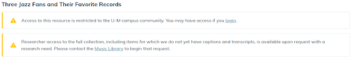
The current interface displays two warning messages in succession communicating all possible scenarios relating to access restrictions. See these warning messages in Girl Singers From Big Bands.
Participants consistently read the first warning message, which tells users they may be able to access the item if they login, but not the second one, which implies (but does not clearly state) that this item may not be available at all because it doesn’t yet have captions and transcripts. They often wouldn’t know what to do when asked how they would access an item. When one participant was asked what they would do next, after seeing the item page with nothing to listen to, they said “I'd probably give up.”
Our solution: communicating concisely and specifically about why users can’t access items, as well as how they can request special access. Rather than displaying two warning messages for all restricted pages, we recommended displaying a single message with instructions on how to gain access, depending on the level of restriction.
If items are available to U-M affiliates, the message will say "U-M login is required to access this item. Access to this resource is restricted to the U-M campus community."
If items are restricted due to the lack of captions and transcripts, the message will say "Access restricted. This item is unavailable because it does not yet have captions and transcripts. Researcher access to the full collection is available upon request with a research need. Please contact the Music Library at music.library@umich.edu to begin that request."
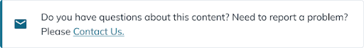
2. The Digital Collections team reported that users were often sending questions and feedback to the wrong email addresses, and we discovered why: The quantity and placement of contact methods caused confusion for users.
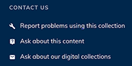
The contact forms the Digital Collection team wanted users to find and use were located in the footer at the bottom of each page, and often went unnoticed.
In usability tests, users often struggled to find the contact forms that our developers were hoping they would use, and instead, found irrelevant email addresses in the body of two different pages. And, when participants did find the contact forms in the footer, they were not sure which link to click.
Our solution: Combine all contact methods into one form, put it in more locations, and make it stand out! Users' mental load will be significantly lighter without needing to select which contact method fits their needs best. Now, we can do that work for them!
Proposed design update of a contact component, which will be placed at the bottom of each page above the footer and at the top of the Help page.
3. We evaluated the usability of our untested but supposedly highly accessible media player and transcript feature with all participants. The media player and transcript received overwhelmingly positive feedback, especially from students with hearing disabilities, but contained a couple of misleading features that caused some confusion for users.
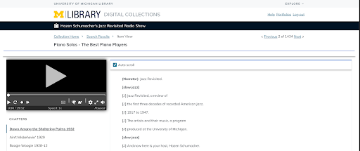
The transcript takes up a large portion of the page, but is not labeled.
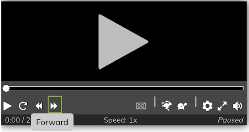
The “Forward” control shown here and “Rewind” control to the left of it skip chapters rather than standard time increments and don’t communicate it clearly
Some users did not recognize what the transcript was, and ignored the rest of the page due to its large size. In addition, one of the media player controls confused participants because it had unexpected behavior - the rewind and forward buttons skipped entire chapters, while participants expected them to skip a set time increment like 15 seconds, similarly to media players like Spotify Podcasts.
Our solution: Coming soon! Due to the limitations of this media player, we are not able to implement our ideal solution, which would be to change the functionality of the forward and rewind buttons from skipping chapters to skipping a standard time increment like 15 seconds. For now, we are adding a clear label above the transcript to make it clearer to users who aren’t familiar with a transcript interface.
Reflection
As an early-career UI/UX Designer, I have a lot to learn when it comes to conducting and analyzing research, as well as collaborating with developers to recommend actionable solutions to the highest-impact issues.
Our greatest win of the project was collecting so much data from such a diverse audience. We were shocked by the high turnout and different perspectives we collected for walk-in testing, which were likely due to our location in the lobby of the Shapiro Library and the ice cold sparkling waters we offered to participants.
Our greatest challenge arose after collecting so much data - it was both a blessing and a curse! The analysis process took a lot of time, effort, and discussion within our UX team, and at first, I didn’t know where to begin. But, with the help of my team, as well as incredibly valuable input from the developers who built this interface, we delivered a prioritized list of over 20 issues and recommendations, many of which were minor usability issues and would take little effort to significantly improve the usability of the audio and moving image interface.
Next Steps
When it came to analyzing results and providing recommendations for improvements, we discovered that a small number of these issues would likely take a lot of time, effort, and design iterations to solve. Similarly, the solutions proposed above may be ideal, but due to the nature of our aged and complex system, could be difficult to implement. Compromise is an essential part of our work as designers, developers, and archivists. As we plan to implement changes in 2024, I am looking forward to collaborating with the talented Digital Collections team to continue improving the user experience of this valuable resource.
I am so grateful to interns Suviksha Hirawat and Ruikun Wang for their hard work, and to Ben Howell and Robyn Ness for their advice and guidance throughout this project.