Submitted by: Marjunique Louis, Master of Science in Information 2024
Introduction
As students, we all know the struggle of trying to find the perfect study space on campus. The Library Environments UX Research Team and the Library Information Technology Design and Discovery (D&D) Team have been working together to improve the user experience of the Library’s study spaces booking website. In order to better understand the needs of our students and how they navigate using the study spaces booking website, we conducted research and usability tests. In this blog post, we will provide an overview of our research process, the usability testing results, and our upcoming plans for implementing the recommendations.
Background
A year ago, the Library Environments team conducted a study space inventory, gathering information about the design, atmosphere, furniture, resources, and proximity of all the library’s study spaces. Additionally, we facilitated an open card sorting activity with students to gather subjective information about their study space preferences. Based on this information, Design and Discovery decided to collaborate with the Library Environments team to conduct UX research.
What We Did
The Design & Discovery Team in Library IT created a low-fidelity mockup. To further validate our prototype, staff from D & D conducted a competitive analysis of study space websites from peer institutions such as Stanford, New York University, Cambridge, University of Minnesota, Northwestern University, University of Texas at Austin, Harvard, Indiana, and the University of Chicago. From this analysis, we selected Cambridge, NYU, UT Austin, and Duke University as the interfaces for usability testing. The UX designer in D & D designed two low-fidelity mockups which were presented to the team in Library Environments, prepared for usability testing.
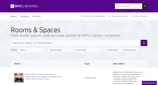
We chose to use NYU’s website to test the use of the search bar, and their provided filters.
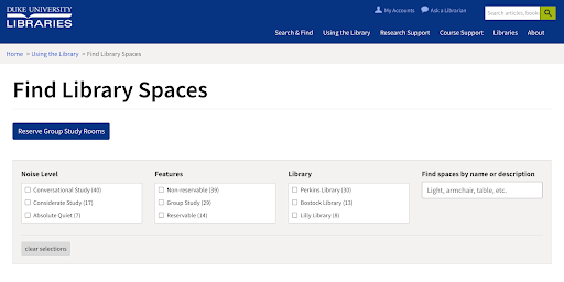
We chose Duke’s website because their website’s layout was relatively different from the other competitors.
Collaborative Online Usability Testing
For usability testing, the team created a research plan and managed recruitment efforts. We aimed to recruit a diverse group of students with a range of academic levels, backgrounds, genders, abilities, and majors/areas of study.
I had the opportunity to work on the script, scenarios, interview questions, and our supporting documents for the usability testing. For each interface, we created 1-3 scenarios which prompted participants to engage with various filter categories, search bars, and maps. Examples of scenarios included finding a study space with a whiteboard for group work or finding a PhD-only study space.
Our usability testing was conducted online. We were fortunate to have the D&D Team as our scribes during the sessions. Collaborating with the D&D team allowed us to focus on leading the usability tests and interviewing users, while they recorded and documented the sessions. After each session, we would debrief about the session and complete a reflection form to document details from the interviews that stood out to us. This form helped us organize our thoughts, and process our discoveries with one another.
What We Learned
Overall, the majority of participants found the searchable and filterable study spaces feature to be useful and easy to navigate when indicators were clear and understandable. We learned that students want a website that is easy to navigate but also provides the information necessary to reserve an ideal study space. They appreciated being able to filter by different criteria such as furniture and resources, and the map feature was also well-received. However, there were some issues with the search bar, with some participants not understanding how to use it effectively.
Here are some of our findings:
What website information helps participants most to find a study space they’re looking for?
- Including library hours
- Including library location
- Including images of study space
- Including various noise levels
- Including a filter that shows reservable vs non reservable study rooms
- Information about what’s included in the study room such as whiteboards, computers, projectors, etc.
- Policies are helpful when they’re understandable and not text heavy
- Brief study space descriptions are helpful
What features would they definitely include in a future website?
- Search bar and map
- Bigger image and images overall
- Interlinkability navigation
- Location directions
- Noise levels
- Checkbox filters
- Multiple filter selection process
- Reservable/non reservable filters
- Information about hours of operation
- Ability to reserve a study space through study reservation website
Considerable outliers
- Include information that mentions nearby prayer rooms
- Include information that mentions nearby food and/or vending machines
- Include information about entry restrictions (who’s allowed in the study space)
- Fun suggestion: a button that gives a randomized suggestion to aid discoverability of new study spaces
What Happens Next
Based on our usability testing results, we recommend the following improvements to the searchable and filterable study spaces feature:
- Students emphasized the importance of images and descriptions. Images and descriptions helped students determine whether the study space would be most suitable for their situation.
- Students also emphasized the importance of directions and guided instructions. U-M is a big campus, so any directions will improve the user’s journey from start to finish.
- Students voiced their frustrations about not being able to reserve study spaces that appear as results; they’d really like a feature that would allow them to filter out non-reservable spaces.
- Noise levels were appreciated amongst students. Though, when including noise levels, we must include noise levels that are commonly known amongst students, so students don’t experience confusion.
- Including the hours of operation is essential to creating a website for students to successfully complete the task of reserving a study space.
- Identifying which spaces were tailored for undergraduate students vs graduate students was important as well. Including a clear indicator in the design could provide clarity for students.
Our next steps will include creating a high-fidelity prototype of a study space reservation interface, and then run a usability test on the new mockup. We look forward to implementing these changes that will enhance students’ library experience. We will continue to work to make the library’s website and environment accessible and easy to use.
The D&D Team played a crucial role in the research process, working in tandem with the Library Environments UX Research Team to ensure that the research was conducted smoothly. Despite the fact that the entire research process was conducted online, the two teams were able to work collaboratively with ease. Communication was clear and the research process was cohesive. I truly enjoyed collaborating with the D&D Team, and I look forward to continuing to work with them once our recommendations are implemented.