Emma Brown
Posts by Emma Brown

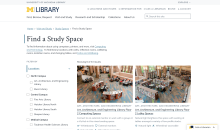
Find a Study Space is a brand new feature on the library website that launched in August 2025, improving our existing study space content and providing students with a new way to explore library study spaces. Learn about our research and design process and some of the key findings we discovered that informed the final product.

How we designed and built our “nearby on shelf” feature for Library Catalog records.

As user experience researchers and designers, it is our job to design better solutions for complex interfaces. Read on to learn our research and design process from discovering a usability issue to proposing solutions in collaboration with developers.

For the past year, U-M Library Digital Collections have been undergoing some big design changes. This blog post tells the story of launching and evaluating the usability of collections containing a new type of media: audio and moving images (AMI). In a research study consisting of a heuristic evaluation and 50 usability tests with a diverse group of users, the team uncovered over 20 mostly minor usability issues, recommended improvements to the interface that will be implemented in 2024 and beyond, and learned a lot about the complexity of library products along the way.

The U-M Library’s digital collections recently expanded to include an Audio and Moving Image (or AMI) digital collections interface. This post details a designer's journey in finding a banner image for the Hazen Schumacher's Jazz Revisited Radio Show digital collection.