Heidi Burkhardt
Posts tagged with Usability
Showing 1 - 10 of 15 items

As part of a broader product accessibility initiative in Library Information Technology, the team behind the library’s website undertook a number of remediation efforts based on the findings of the site’s baseline accessibility evaluation. The work demonstrates how accessibility remediation can also be an opportunity for code clean-up, usability improvements, and refreshing design elements.
Part 2 of the series "Uncovering Needs of Filipino Researchers with our Philippines Digital Collection" explores a UX research study aimed at improving the University of Michigan’s Philippines digital collection interface. The study initially focused on understanding user pain points with the legacy collection interface. Following the launch of a redesigned interface, short-term fixes were implemented based on user feedback, while long-term needs were documented for future platform updates.
In June 2003, the University of Michigan Library launched the Philippines digital collection, “The United States and its Territories, 1870 - 1925: The Age of Imperialism.” Featuring over 4,000 historical texts, it has seen significant engagement from Filipino users for twenty years. Contextual inquiry interviews with Filipino researchers revealed their appreciation for the preservation and access to historical materials, their enthusiasm for being included in research and design activities and opportunities to improve usability in specific areas. Our findings show the importance of enhancing digital collections to support researchers and preserve cultural heritage, especially for communities who have experienced the loss of these materials in their country of origin.
After the successful launch of our ArcLight finding aids application on April 19, 2023 - and the deprecating of our homegrown Digital Library eXtension Service (DLXS) finding aids application - we are sharing our reflections on the project with the wider community. This blog post will describe the history of finding aids at the University of Michigan Library and what led us to develop the ArcLight finding aids application, starting in earnest in 2020. We will describe our goals for the project, the organization of the development team, and the modifications that we needed to make to effectively complete the project. We will give an overview of what a finding aids application does, and why we decided to use ArcLight as well as Docker and Kubernetes as our new containerization and hosting solution. We will discuss what was advantageous to us for this project as well as what was particularly challenging, and sum up what we learned from our archives partners and end-users, throughout the project.
In Fall 2022, the Library Environments department began a pilot of two designated “zoned” spaces in response to user feedback asking for more information about what to expect from a study space. We conducted focus groups and integrated participatory design to learn about how users are perceiving and experiencing these labeled spaces.
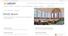
As students, we all know the struggle of trying to find the perfect study space on campus. The Library Environments UX Research Team and the Library Information Technology Design and Discovery (D&D) Team worked together to improve the user experience of the Library’s study spaces booking website.
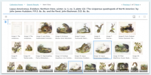
It’s been nearly a decade since we last refreshed our image digital collections. At that time, we created a standard web template, constructed consistent help pages, cleaned up our collection home pages, and built what was at the time an easier way to view and interact with the images in the interface. This time, we’re doing more! We have a brand-new interface and a number of additional and improved features.

The Michigan Library Scholars application jumped out at me back in February. I’m a rising junior studying economics & communications with a minor in Spanish, hoping to ultimately work for a non-profit one day. I saw the Askwith project and was immediately drawn to it because the majority of my classes this past semester were on globalization. Slowly I began to understand the necessity of being culturally aware and maintaining diversity in a world where homogeneity is often expected. Knowing I had been confined to my own “single-story,” or was truly only familiar with my home country, became an impediment to my perspective on the global community. The MLS program stood out to me then, and now, because I got to be part of a team of classmates and mentors working to end narrow-mindedness at UM.
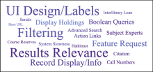
U-M Library’s Library Search launched in 2018 as a unified search engine application containing five previously distinct interfaces: Catalog, Articles, Databases, Online Journals, and Library Websites. Library Search was a big change for users, and an increase in user support requests suggested that further exploration was needed to pinpoint user pain points. The authors began an exploratory study that helped understand users’ experiences and identified areas for continued work.
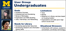
The first post ("Personas: A Classic User Experience Design Technique") in this 2-part series described what personas are and, generally, how to create them. I closed with some cautions about ways personas might come out less than helpful – creating flat, overloaded, or fake (unresearched) personas. The second post presents our persona development for a specific website project.