Introduction and Background of Research
This section provides a recap from the first post in this series - “Uncovering Needs of Filipino Researchers with our Philippines Digital Collection: Part 1”.
From February to March 1945, the Battle of Manila unfolded as one of history's largest urban conflicts, resulting in over 100,000 deaths and leaving the city in ruins. This catastrophic event not only devastated human life but also obliterated centuries of Filipino cultural heritage, including architectural marvels and vital historical documents. Despite the passage of time, Filipino researchers continue to face challenges in recovering lost primary sources. In 2003, the University of Michigan Library created a digital collection, "The United States and its Territories, 1870 - 1925," which has since served as a crucial resource for researchers, particularly from the Philippines. The collection has drawn significant engagement, with 75% or more of users located in the Philippines, prompting our deeper inquiry into their experiences and expectations with using the collection.
To better understand the needs of Filipino researchers, the digital collection team at the University of Michigan conducted remote contextual inquiry interviews with several researchers. The interviews revealed that researchers valued the digital collection for its comprehensive historical documents, despite some challenging usability issues. Researchers expressed a strong desire for improved access to and downloads of digital materials, like the ability to download complete items for offline research instead of single pages. Additionally, researchers highlighted the significance of digital collections in supporting cultural memory and heritage in local communities in the Philippines, noting the desire for collaboration between digital collection teams and the communities they serve.
A shift from discovery research to evaluative usability research
Our study started with researchers showing how they used the legacy Philippines collection interface, which has been used by Filipino scholars for more than 20 years. Because we were talking with users who have years of experience interacting with the site, our intention was to perform a deeper generative research about their needs - we were passionate about drafting a user journey that identified key pain points and recommendations that could inspire the digital collections team as a long-term user focused roadmap, even if recommendations were not technically feasible in the short term.
After conducting the first three of our six contextual inquiry sessions, the redesigned Philippines collection interface was launched. As researchers interacted with the new interface, we observed that many usability issues researchers faced previously with the legacy Philippines collection were resolved by improvements in the redesigned Digital Collections interface. However, our research participants encountered both minor issues that we wanted to address quickly and deeper issues with legacy pages in the site that interrupted navigation, poor search result relevance and unhelpful or redundant search result metadata.
The launch of the new front end of our digital collection interface led us to adapt the overall purpose and deliverable of the project – we wanted to generate more actionable short-term usability findings and recommendations. We targeted our users' perceptions and experiences with collection websites. We caught important bugs and recommended high impact low-effort fixes that greatly improved our participants' experience with the Philippines collection website. We documented and celebrated the improvements to the site that most impacted Filipino researchers as they used the digital collection.
Key Research Findings, Recommendations, and Improvements
In this blog post (part 2), we want to share some of the most impactful improvements from the redesigned Digital Collections interface (front end) for our Filipino research participants. We were able to help the digital collections team identify and make 3 short term improvements from our research. We also logged 7 longer-term user needs and improvements that users want to see in the future platform backend redesign and replacement.
Interface improvements that resolved usability issues
During our interview process, certain aspects of the legacy site that were causing severe usability issues were fixed with the redesigned front end. Previously, the legacy site displayed either the text (OCR) format or the image (scanned original) format by default. It was so difficult for users to find the format switch option that many people didn’t know that multiple formats were available.
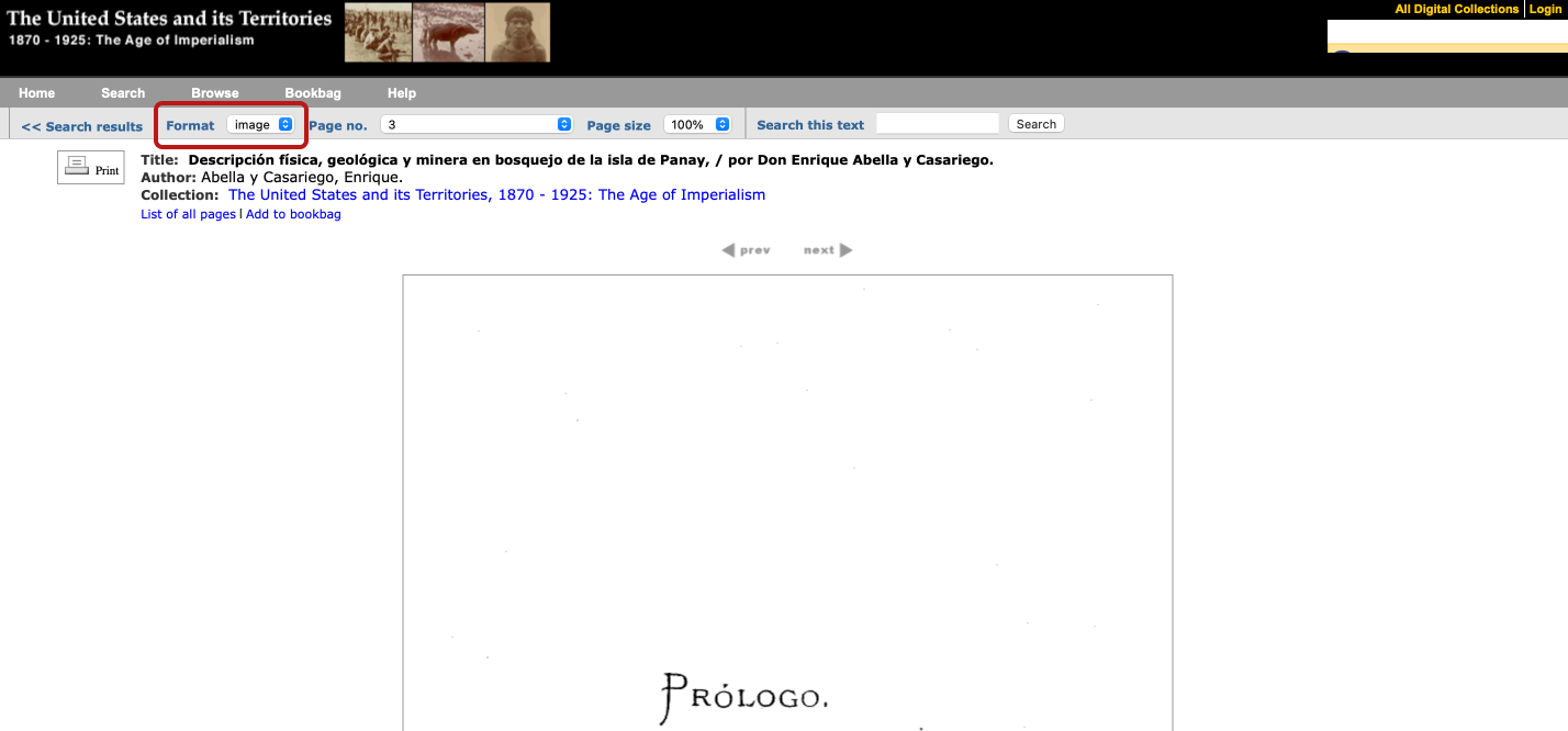
Format switch options (outlined in red underneath the primary navigation) were hard to notice on the legacy interface.
The improved page viewer displays page navigation, image scan and OCR text side-by-side by default. The controls for turning on page navigation, image or text for individual pages is far more prominent and easy for users to discover and use.
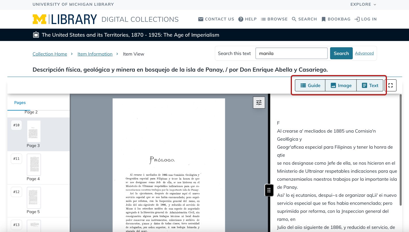
Improved format switch options (outlined in red above the OCR text) were easier to notice in the redesigned interface.
Impact: For users, having both the OCR text and the image scan co-located for each page is transformational, reducing confusion and bounce rates while vastly improving their ability to find promising research materials in our digital collections.
Quick fixes based on research findings
On the legacy interface, item search results did not display matches through search term highlighting in a snippet of OCR'd text. Results only displayed title, author, and publisher information. This caused users to spend extra time clicking into each page to find the highlight and limited the usefulness of search results to determine relevance.
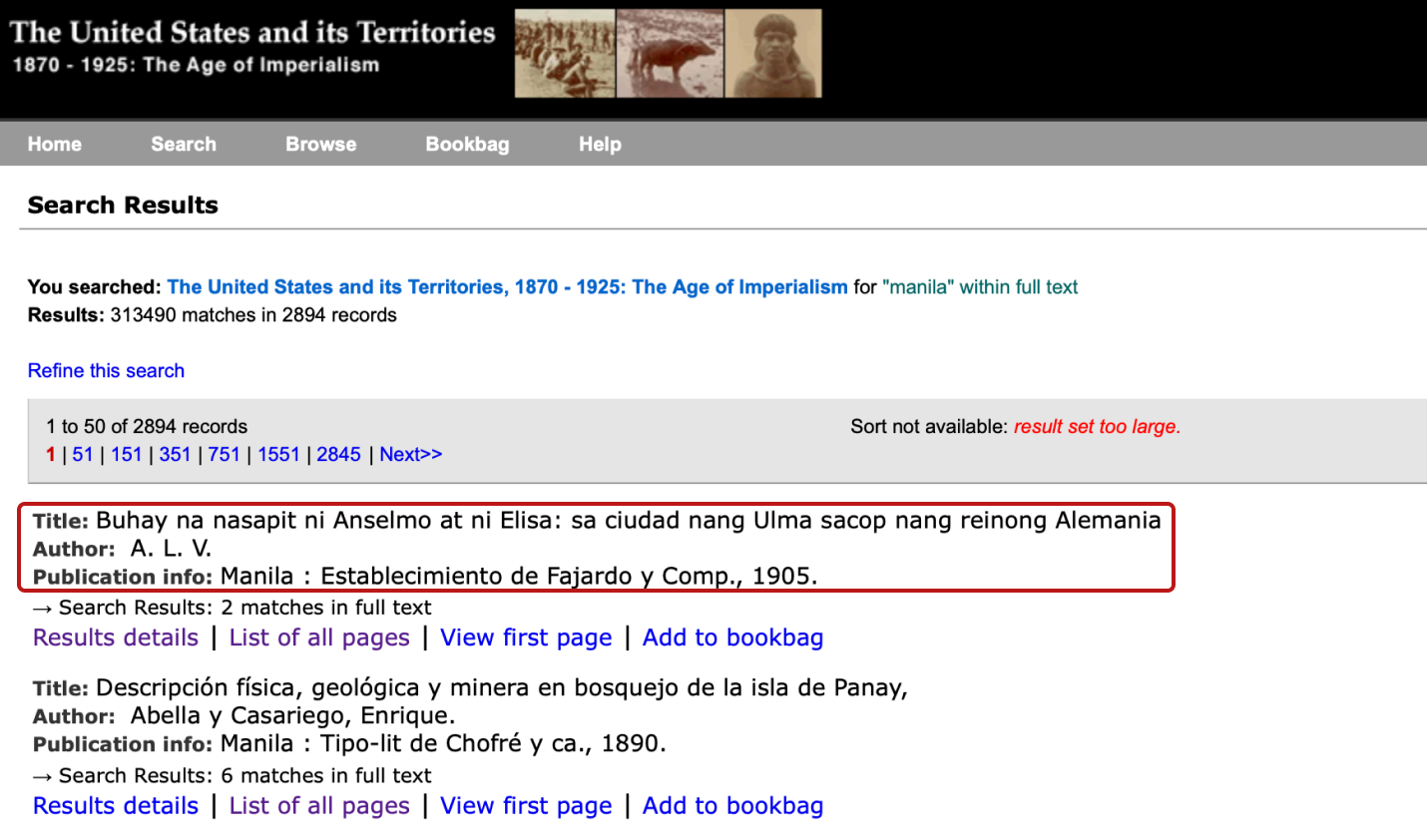
Before: Search results did not have keyword match snippets, causing users to hunt and peck for promising pages (going in and out of the page viewer and returning to search results)
In the search results page, snippets containing the keyword match were added under the item display. This way users did not have to click into each result to view the match - they could immediately identify the context of the keyword match and determine the relevance of the result to their search purpose.
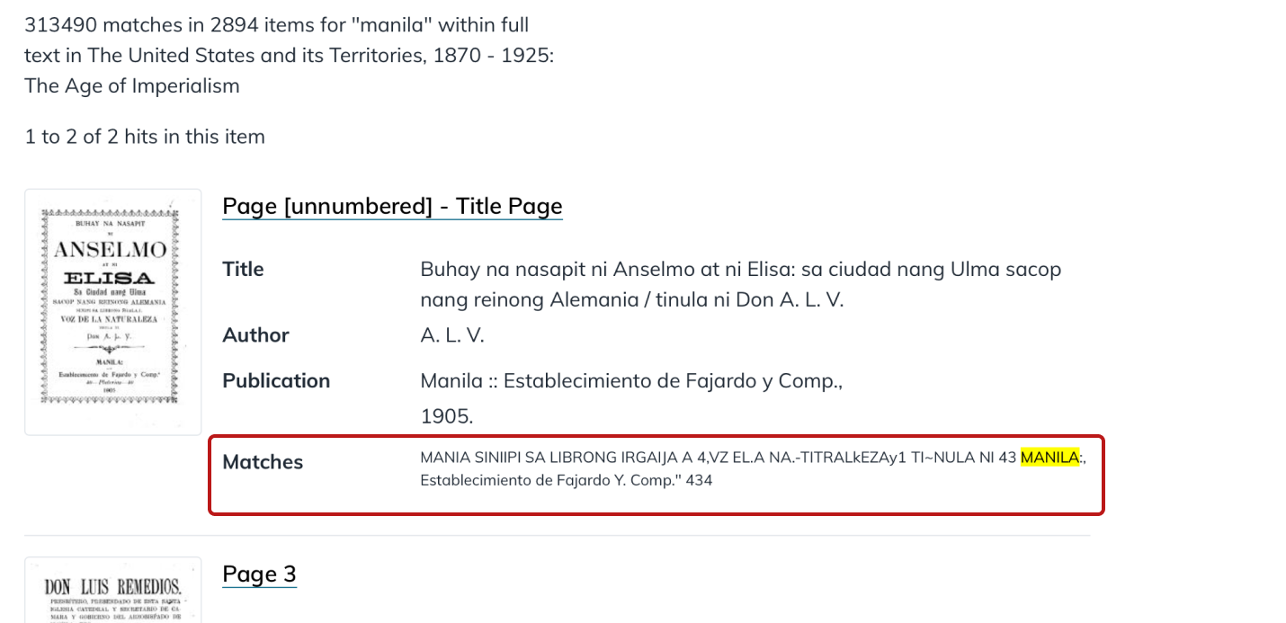
After: Snippets are added to item search results. The highlighted matches give users a preview of the nature of the content, helping them decide if it’s useful.
Impact: Users are better able to determine search result relevance before they click into each page to scan for the search term.
Another usability issue we found while observing researchers had to do with download item options. Most researchers expected the “Download Item” button to mean that they could download the entire item in a PDF or other format with all pages. However, the button only allowed users to download one page at a time. This label and functionality confused and disappointed researchers who want to quickly find promising materials, download them to their own computer, and then review many results in depth later.
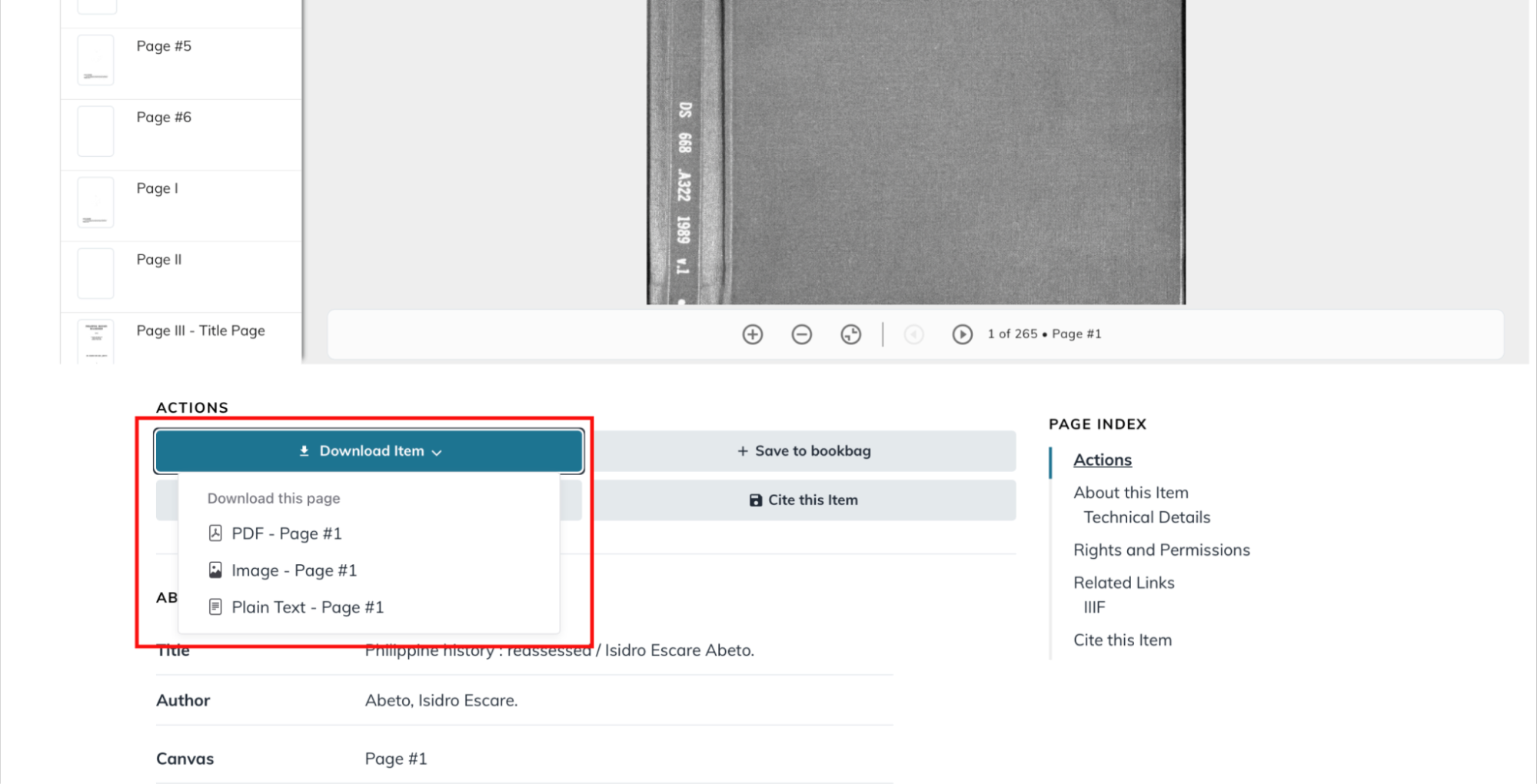
Before: The “Download item” label made users think they could download all the pages for an item but they could only download one page at a time. (The resulting change occurred on an already improved interface page.)
We suggested changing the label of the button to more accurately describe the function’s scope. The label was changed from “Download Item” to “Download Options” to more generally describe the download options and not mislead users.
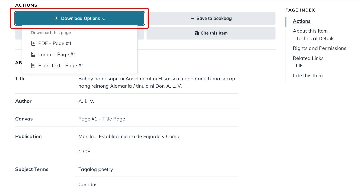
After: The “Download Item” label is changed to “Download Options”, accurately describing the currently available download options.
Impact: This quick fix was clearer to researchers and even though they greatly preferred the ability to download the whole item, the label was accurate and not misleading.
For a longer term implementation, we recommended identifying items out of copyright that actually allow downloading the whole item (all pages). This change in qualifying materials will meet researcher needs and expectations.
The Digital Collections team has made significant improvements to the legacy interface to address critical usability issues identified by Filipino researchers. Three key short-term improvements enhanced user experience, including a side-by-side display of OCR text and scans of digitized materials in the page viewer, a clearer "Download Options" button in the page viewer metadata, and highlighted search term snippets in search results. Additionally, seven longer-term user needs have been identified for future enhancements in which replacing the backend system will provide improvements in search relevance and indexing. These changes will not only improve access to essential research materials but also support users as they search and navigate within and between collections.
Long Term Recommendations
There were several key themes in our research that we couldn’t take immediate action on. We were glad that we could pass our findings and coordinate with other UX team members who carried out simultaneous research on several other text based digital collections. By sharing our study findings during their planning phase, they were able to adjust the scope of their research questions based on our previous research. This helped our team members focus on specific areas that our study didn’t cover.
One insight that emerged from both our studies involved the desire all researchers have to get to page viewers in as few steps as possible. Researchers often search Google to find items within our Digital Collections and they expect to click on Google Results and then to go straight to the page viewer. They spoke of the need to have context of scans of original documents to know if the content was promising or not. Currently the architecture of digital collections pushes up legacy index pages in Google’s SEO and results. When the digital collections platform was created over twenty years ago, these legacy index pages held primarily OCR text content. Users often see these legacy index pages as an unwanted “speed bump”.
We recommended that in the future these legacy index pages be removed from the site structure where appropriate. This would reduce the complexity of the site and we can respond to the common expectations people had to both view and navigate on the same page instead of ping-ponging back and forth between search results or an index of linked page numbers and the page viewer.
Beyond reporting each of our findings, both our research teams created a UX Research Findings and Recommendations Inventory to gather all short term and long term recommendations and key insights. This will allow staff working on the Digital Collections backend replacement to easily refer back to the documentation to help complement technical decisions with well described user needs and expectations.
Both our teams were so glad that we could carry out separate research on the same application in the span of a few months (see the blog post on the other team’s research). The timing helped us to make valuable contributions to short term fixes right after the new interface launched. We are also excited that UX team members will be devoting their time and focus to the redesign and replacement of the digital collections backend.
Conclusion
Our exploration of the Philippines digital collection highlights the importance of targeted UX research in addressing the unique needs of Filipino researchers. This project not only illuminated areas for improvement but also fostered valuable relationships between international scholars, library staff, and faculty. By emphasizing empathy and user-centered design, we can create digital collections that resonate with diverse communities and enhance access to global knowledge. Moving forward, we remain committed to connecting with the researcher communities we serve, ensuring our digital resources evolve to meet their needs effectively.