Led by Bridget Burke, Senior Front-End Developer and Accessibility Specialist, our Library Information Technology division is in the midst of an LIT Product Accessibility Initiative to align with the new processes and procedures required by the University’s EIT Accessibility SPG. Baseline accessibility evaluations are at the core of the initiative.
A baseline evaluation is a short, tightly scoped evaluation that uses automated and manual testing to discover WCAG 2.2 AA violations and blockers for keyboard and screen reader users. An important part of the testing process is providing actionable issues to product teams. In order for a product to be considered in “good health,” teams must remediate any issues after their results are delivered.
We expect this work will move us towards our longtime goal of creating better systems and compliance for the accessibility of our digital products. It will also help us be more prepared for web and mobile accessibility Title II compliance in 2026.
The library website’s baseline results
Our library website — launched in summer 2020 after a complete redesign — was planned, designed, and developed with diverse needs in mind. This helped us ensure content is perceivable and understandable and components are operable with a variety of inputs (mouse, keyboard). In the baseline testing, the website met and exceeded many criteria for usability and accessibility. All functional tests were able to be completed with keyboard and screen reader.
But…it’s not perfect. The testing found 2 violations and 1 warning:
- Invalid use of aria-labels on elements on main hours page
- An insufficient table caption violation in our Staff Directory
- Improper heading level warnings in specific “card style” presentations
There were also two advisories around contrast and visibility of decorative icons and visibility of the actively selected page in the side navigation.
As the product manager for the library website, I broke the findings down into tasks for our team to work on. We prioritized work by focusing on the violations first, as well as noting when issues were code-focused or only needed light design consultation versus more concentrated design attention.
Upon reflection, the work we completed ended up falling into three themes — code clean-up, usability, and design refreshes — that demonstrate how remediation ultimately serves our digital products.
Remediation and code clean-up are besties
The least glamorous of the remediations were the invalid aria-labels and skipped heading levels, but in the end they were mostly code clean-up. We redesigned the website in phases over the period of 2+ years, which inevitably leads to some inconsistencies.
With that, a bonus of this accessibility remediation work is that it gave Josh Salazar, our lead front-end developer for the website who wasn’t here when we initially built the site, the opportunity to dig more deeply into the code as part of his ongoing onboarding. The aria-label remediation required investigation and screen reader testing to find a solution: removing them! The content of the elements was already being read aloud and the aria-label wasn’t necessary.
The improper heading structure warnings were upsetting to find because we pay super close attention to it in creating body content and didn’t know this was happening in the front-end code. But it was another spot for Josh to dig into different areas of the code since it was in a couple of different “card templates” in different contexts.

An accessibility warning in our presentation of upcoming events on our homepage that used improper heading structure prior to remediation.
One fix was a change from heading 2 to a heading 3, while the other required adding a conditional so the heading applies correctly depending on whether there is already a heading 2.
Remediation and usability are buds too
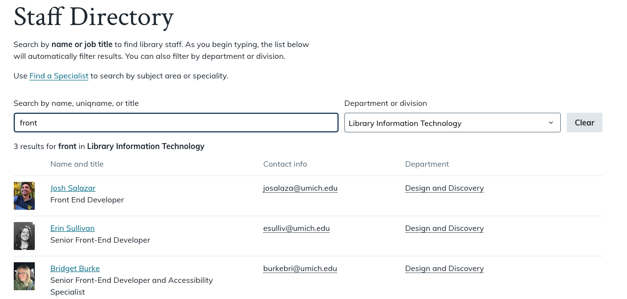
A ticket titled “remediate violations on dynamic tables” may not sound like a potential usability improvement, but in our case it very much was. Our Staff Directory and Find a Specialist pages were the “dynamic tables” in question. The caption of the table was always showing the total number of rows in the table and it was announced for screen reader users regardless of how many results were actually displayed. We also had a ticket in our backlog to “explore adding a search summary to Staff Directory and Find Specialist” based on past usability testing.
It turned out we had a stylized caption on the table that was aria-hidden and only read by screen readers. Josh made it visible and accessible to everyone. He also added formatting to show the input variables, as well some logic to build the caption results string depending on the search values. Emma Brown, our UI/UX Designer, consulted on the styling for this caption/search summary, and we now have dynamic result summaries that are helpful for everyone.

Our Staff Directory with a dynamic results summary displayed below the search box.
Plus…remediation can be a design refresh
The University of Michigan’s colors are maize and blue. Aaaand the maize doesn’t meet color contrast requirements on various backgrounds. We had been using maize for some of our decorative icons and decided it was time to move away from it since this was an advisory in the baseline results. We also have decorative icons on our location pages that have backgrounds behind them that didn’t meet contrast.
To remediate, we worked with Emma to explore secondary options in our color palette and ended up bringing in more indigo and green. We changed maize icons used to indicate hours to indigo, which is what we already used on location pages.
The Shapiro Library location “card” icons with maize did not meet color contrast, but with indigo they do.
On those location pages (like for the Computer and Video Game Archive), we changed our “contact” icon from maize to green, and increased the contrast across the board.
A subtle change in the color of icons with backgrounds behind them was the difference between meeting contrast requirements and not. Also it was fun to introduce some green!
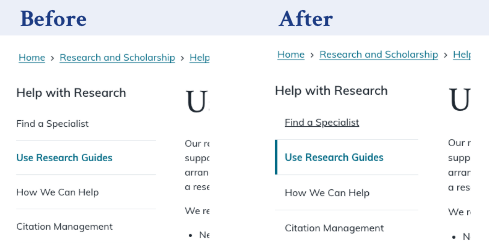
Our final remediation work was around the visibility of the actively selected page in the side navigation. The baseline results indicated that the styling used for the active page could be improved for those with color blindness and low vision. It used teal and bold, but was still hard to distinguish. Emma and Suvi Hirawat, our temp UI Designer, took the design task and tried out a number of options, keeping in mind how it would appear for a selected parent, child, or standalone page. We ultimately landed on adding a teal vertical line next to the selected page in addition to the existing styling.

The selected page in our side navigation was only bold and teal and now also includes a teal vertical line on the left border.
While these are all subtle changes, it’s been a nice little refresh for our 4+ years old site while also remediating accessibility advisories.
Conclusion and acknowledgements
We were mindful when building the library website to integrate accessibility from the start, but it’s natural to miss things, as well as adjust our best practices as we learn more. Being able to give concentrated attention to accessibility remediation was a great opportunity to shore up the quality of our website and set us up for future enhancements work.
Accessibility remediation efforts like this are very much a team effort. Many thanks to Josh for diving into an intense code base, always bringing a problem solving eye and keen attention to detail, and implementing solutions that ultimately gave us a stronger foundation. Emma and Suvi provided thoughtful design solutions and always kept our color contrast on point. And Bridget is such a pro. She presents baseline findings in a way that are easily actionable for product teams and her expertise in supporting teams as they figure out the best way to remediate issues is invaluable.