Margot Finn
Posts tagged with Design
Showing 1 - 10 of 15 items
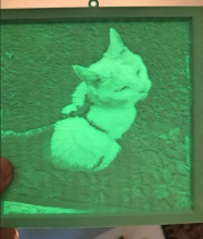
After years of ordering lithopanes online to memorialize pets, I decided to make one myself using the library’s 3D printers. With help from the design lab, I learned to prepare files, choose materials, and ultimately printed a mint-green suncatcher of Snapdragon that turned out beautifully.
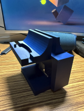
A multi-use desk attachment that allows the user to store a tablet and clamp a desk light all while not requiring additional fasteners.
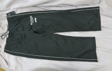
I used the Sewing Machine in SDL to do a simple hem on a pair of birthday Pants.
As user experience researchers and designers, it is our job to design better solutions for complex interfaces. Read on to learn our research and design process from discovering a usability issue to proposing solutions in collaboration with developers.
•
With the help of 3D printer of Shapiro Design Lab, I completed my project of making a two part mold for a fishing lure.
•
Through Mari Katayama of Stamps Speaker Series and the accessibility team at the Shapiro Design Lab, I learned how to bring changes within my own passions to make the university more accessible through design.
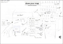
It’s not uncommon for academic research libraries, especially large ones, to have multiple renovations that add a wing, a floor, or even a new building. The University of Michigan Library buildings on our central campus are no exception. Our undergraduate and graduate libraries form a complex whose structure is just that. Many times a day, staff members direct visitors, patrons, or even a colleague to their intended destination.
