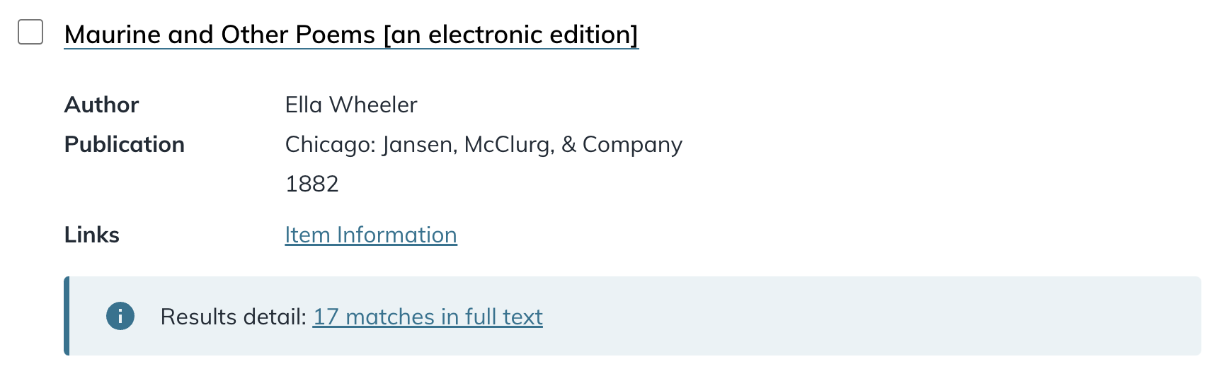
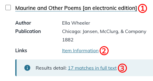
Imagine you are searching for a single word within a text digital collection of poetry. As you peruse results, each item in this list looks similar to the one above, containing: 1) a link with the text of the title, 2) some metadata, including another link to “item information,” and 3) one final, highlighted link, telling you how many matches to your search term there are in this item.
That’s 3 links in 1 item. Which one would you click on to view your search matches?
During a usability study conducted in Spring 2024, we discovered that answers to this question varied widely, even among seasoned professionals in libraries and archives.
As user experience researchers and designers, it is our job to design better solutions for complex interfaces. Read on to learn our research and design process from discovering a usability issue to proposing solutions in collaboration with developers.
About the study
For the past 4 years, a team of librarians, archivists, developers, UX specialists, and project managers have been redesigning the user interface of the U-M Library Digital Collections platform. The final phase in this massive project was redesigning over 100 text collections, many of which were published in the 1990s and were updated at different rates over 20 years. The complexity of this project required a lot of time and expertise from our developers and collection managers. At the end of each step in this project, members of the User Experience Team conducted usability studies to evaluate the redesigned interfaces, identify usability and accessibility issues, and recommend improvements to make the U-M Library Digital Collections platform better.
In this phase, our team spoke with 6 librarians and archivists who were regular users of text digital collections to understand how expert users interacted with the redesigned platform, and to recommend improvements that would be appreciated by the communities that use digital collections the most.
What we learned from users
Expert users know what they are looking for and they want to get there faster
While past usability studies included participants who had never used digital collections before, we focused on feedback from more familiar users this time. These users showed examples of how they use digital collections as a part of their work, with real searches and real frustrations included. Their feedback highlighted the importance of designing for efficiency and clarity.
We noticed a stark difference in efficiency between two common paths: searching and browsing.
Searching in a collection

Searching for a word or phrase led users to a list of items much like the one shown and described at the beginning of this post, and if they selected the third link, which shows the number of matches in the text, they would be taken directly to the page viewer.
Browsing in a collection

Browsing, on the other hand, as well as the other two links from an item in the search results list, added a barrier in users’ paths: an extra page containing robust item metadata and an inconsistently detailed table of contents, without displaying any of the actual content of the item that users were searching for. This barrier is called the item information page, and its existence slowed users from getting to the content in multiple digital text collections during our research and, almost certainly, in any use of these text collections. It also contained the same metadata that was already present on the item viewer page.
When asked about their perception of the item information page, some participants appreciated the prominence of the metadata, but even those users struggled to access the item viewer from there. One participant said, “Weird that from here [item information page] I can’t just see the front page and start flipping.”
This page reflects the structure of collections from the 1990s, which contained a table of contents and plain text, but no images or scans of items that most users expect today. While structural changes were not possible in this project, the UX team made note of the negative interactions some participants had with this page to save for a future project focused on reconstructing this platform.
Too many links in search results, too many steps to get to the content
Returning to the example from earlier, the abundance of links in search results was overwhelming. Users were unsure which link to click to view the content, leading to exploratory clicks and a mismatch in where they thought they would land and where they actually landed.
They encountered three links:
- Link 1: Typically takes users to the item viewer, but typically lands on the first page of the item, not the first page with a matching term. (However, for some collections, this link takes users to the item information page as described above.)
- Link 2: Always takes users to the item information page.
- Link 3: Directly led to a list of all matches in an item in context.
Generally, we found that participants clicked on link 1 before link 3 , and never clicked on link 2 . While link 3 has styling that makes it stand out, it falls at the bottom of each item in the list, which means users are most likely going to read it last and often click the top link before reading any further. Another reason this might occur is because this layout of search results closely resembles that of search engines like Google, which link to the target content from the heading.
It was clear that this layout could benefit from simplifications. Next, we had to determine how to do that.
What we improved
In order to improve this experience for users, we relied on hierarchical principles to guide users to find what they are looking for. We asked ourselves, “how can we design the results interface to allow users to not think too hard about their choices?” We spoke with developers to understand their prior design decisions and the scope of this project – while a future team will completely reconstruct this platform, their job was to put a new face on old technology. So, we focused on quick fixes to the interface rather than large structural changes for this project and will be addressing larger updates related to the item information page in the future.
Recommendation
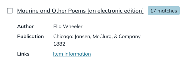
Rather than having 2 links that appear like potential methods to view search results, we combined the information from both into a single line at the top of the search result item, containing the item title and the number of matches in an adjacent badge. By reducing the number of links, we streamlined the decision-making process for users, making it faster and more intuitive. This single link at the top of each item leads to a list of matches in context by page, and from there, users can access the page viewer with their highlighted matches exactly as they would have expected. Those users who are interested in seeing all the metadata can still click the “item information” link, but it is clearly secondary to the primary goal of viewing search matches.
Lessons learned
The value of usability testing lies in its ability to uncover subtle yet significant ways to enhance user experience. Through diligent observation and engagement with our users, we can identify and address small pain points that may otherwise go unnoticed or be assumed as unchangeable. These minor frustrations, when aggregated, significantly impact the overall usability of and satisfaction with a platform.
In this project, we uncovered an opportunity to reduce users’ confusion and cognitive load while simplifying an information-dense interface. While providing multiple paths to reach an end destination can be helpful sometimes, without user testing, we would not have understood how small parts of an interface like these negatively impact the experiences of users, especially those who rely on digital collections for their daily work. Looking forward, we were able to provide recommendations for improvement on a larger scale – informing the work of future teams who will reconstruct the digital collections platform.