Introduction
On August 13, 2025, my team in Design & Discovery launched Find a Study Space, a brand new feature on the library website that improves our existing study space content and provides students with a new way to explore library study spaces.
I’ve worked on Find a Study Space since I started at the library in Fall 2022, and it was a dream of my library colleagues long before that. Our goal was to improve the discoverability of library study spaces on our website and share the information students really want to know about a space before they go there.
Our study space finder was inspired by other universities’ implementations of the same concept. Examples include Cambridge University’s Spacefinder (open source, see github) and UT Austin’s “Explore Spaces” page.
Read along to learn more about how we designed, built, and tested Find a Study Space to make it valuable to our student body.
Our iterative research and design process
We iteratively researched and designed this feature over 3 years while balancing other projects and responsibilities. This process included three rounds of user testing.
Exploratory research
During Fall 2022, I collaborated with Denise Leyton and our UX interns to conduct a comparative analysis of study space finders built by other university libraries.
After facilitating usability tests of Duke, Cambridge, NYU, and UT Austin’s study space finders with 15 U-M students, we generated requirements for our own design and got to work.
Figma prototype

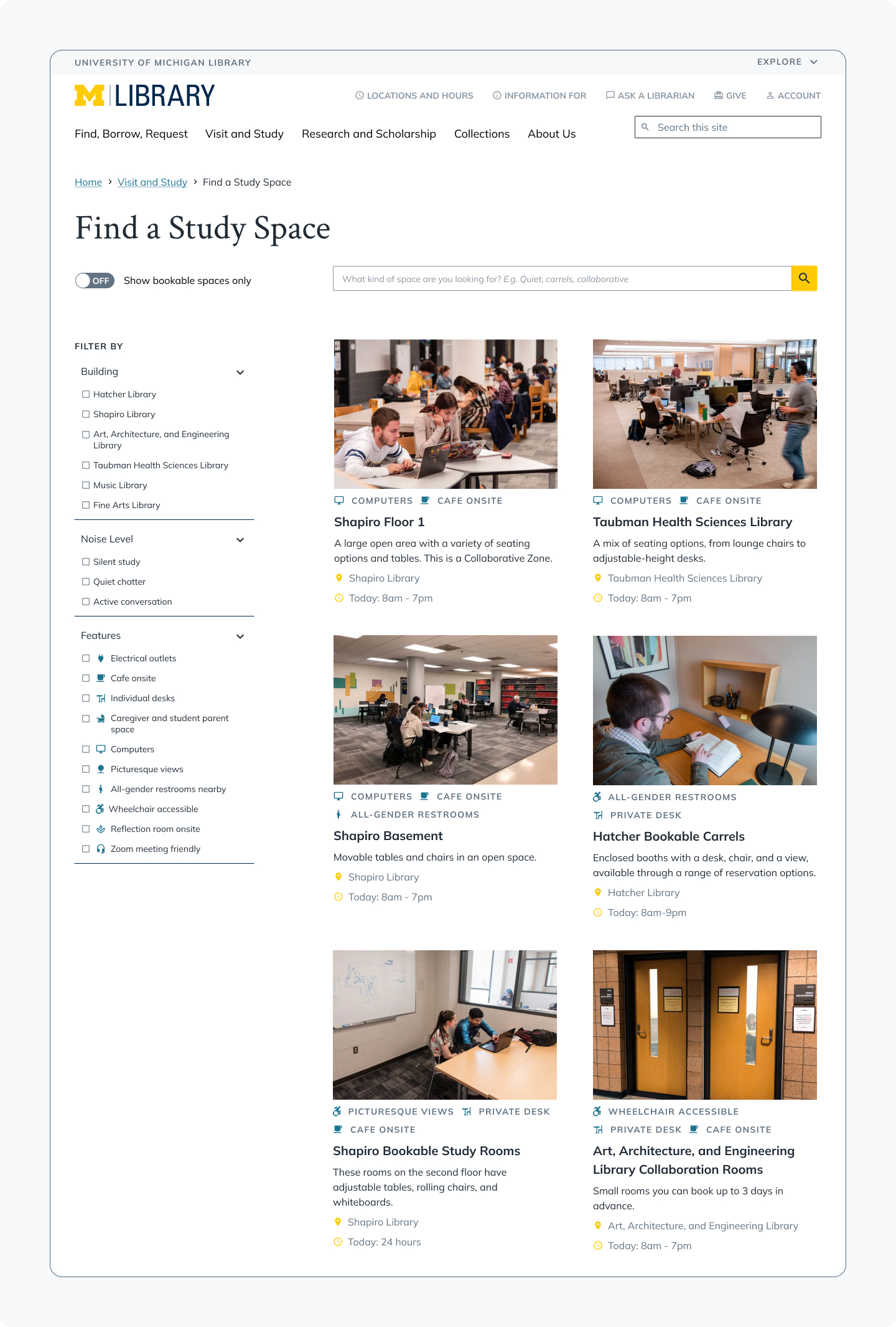
First prototype of the Find a Study Space interface, showing the initial layout and styling approach.
During Spring 2023, after an internal review of our initial designs for Find a Study Space, we tested a minimally interactive prototype with 10 U-M students to evaluate the content and design decisions we made.
Changes we made after this round of testing included:
- Updating the styling of the feature filters and space cards with the help of the Design System team.
- Rethinking the words we used for noise levels (more on that later).
- Revisiting the list of features we provided as filters, after learning that some features, while desired by our participants, were hard to define.
- Redesigning the space details page template to better highlight important details like floor plans and building location.
Coded prototype

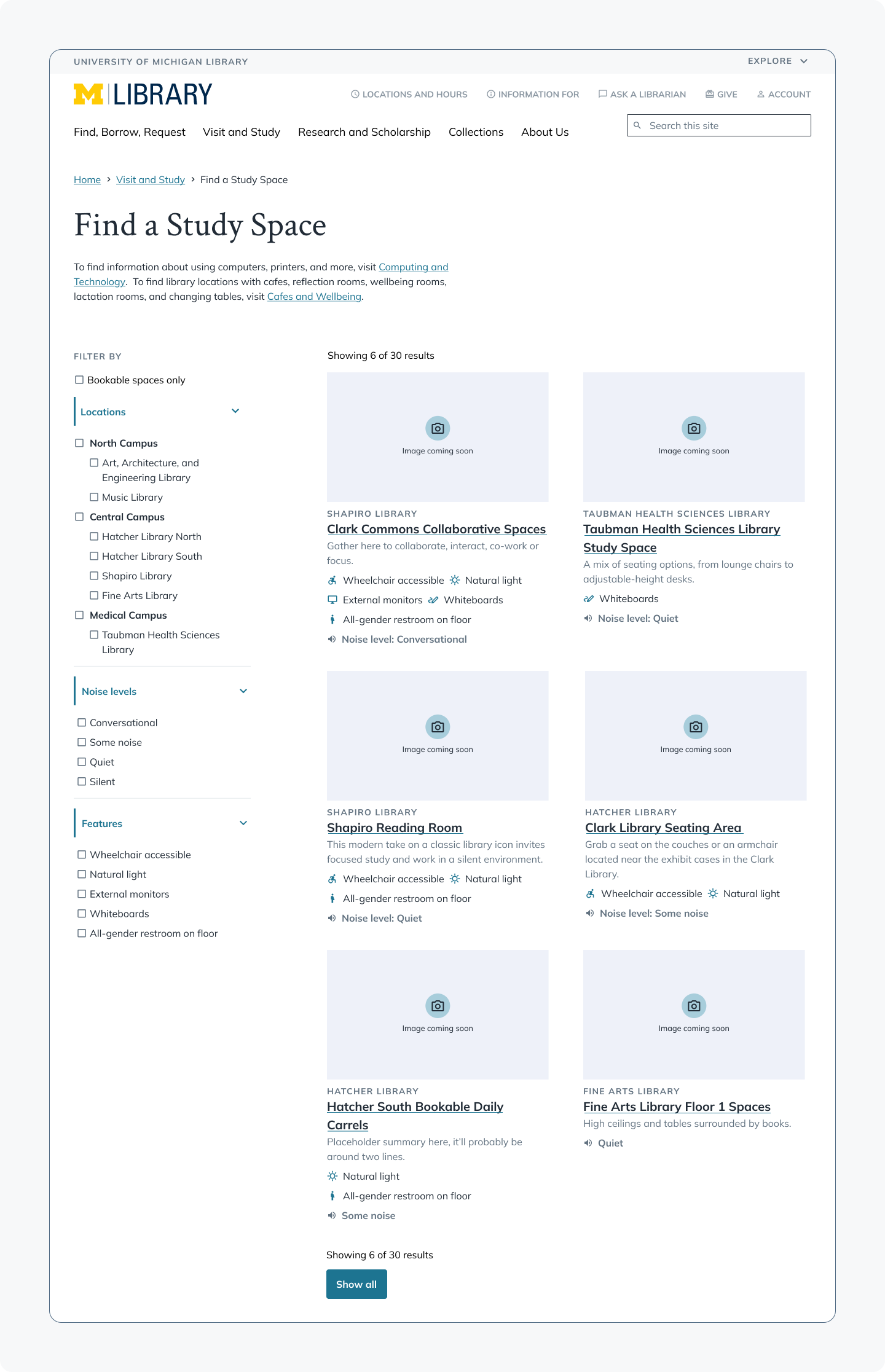
Updated prototype of the Find a Study Space interface with improved UI styles. In the version we tested with, most spaces included images, though placeholders are shown here.
During Summer 2025, we made some significant UI improvements and collaborated with the library Space Planning Team to address content issues that arose during the first evaluation of Find a Study Space. After two rounds of research and design, we hoped to validate design and content changes we had made, and find opportunities for quick wins to improve the interface even more before launching in August.
Changes we made after this second round of testing included:
- Adding a link to the building information page on the space details page template, after some participants expressed that they didn’t know where some buildings are, especially those that have informal names used more commonly among undergraduate students.
- Rethinking the words we used for noise levels, again (still more on that later).
- Shifting the placement of the “bookable space” checkbox from its standalone position to being nested under the “features” category, after a clever study participant recommended it.
Key findings
After three rounds of usability testing and designing, a few themes emerged.
High value of images
In all three rounds of testing, the most consistent and strongest held opinions were those about the high value of seeing images of the study spaces.
Even if we described features of a space in words, study participants did not believe those words if the features were not also shown in the space’s image. For example, if we labeled a space as having external monitors, but the photo of the space did not show those monitors, study participants would question whether the space actually had external monitors or not.
Through these studies, we identified a list of existing study spaces that would benefit from having new photos taken to better showcase their layouts and desirable features. Those images will be taken during the Fall 2025 semester to get a better representation of the busyness of spaces during the regular school year. If you visit lib.umich.edu now, you’ll see many updated images already!
Challenges in understanding noise levels
Noise levels are hard to define. We got it wrong twice before we settled on our final options.
Noise levels of library spaces often change throughout the course of a day, week, and semester — especially the more popular spaces. As a result, descriptions of noise levels were often considered subjective, and study participants struggled to define the terms we chose. The team debated the number of noise levels and terms to include in the coded prototype for weeks, but after all that thought, our choices were still met with confusion.

Version 1 of our noise level options was “silent study,” “quiet chatter,” and “active conversation.” Version 2 was “silent,” “quiet,” “some noise,” and “conversational.” Version 3 is “conversational,” “low noise,” and “quiet”.
“I'm not exactly sure what ‘some noise’ means, if I'm being honest. And ‘quiet’ and ‘silent’ to me seem like the same as well.”
The terms we settled on were “Conversational,” “Low noise,” and “Quiet.” Our goal with this iteration was to use the most plain language possible, and to consistently use terms that described both the general noise level and the type of voices you’d hear in the space. We verified their meanings with internal teams before launching the final version of Find a Study Space with these new noise levels.
Limitations of Find a Study Space
Find a Study Space can’t solve every problem or desire we uncovered in our research — but it still has significant value.
We had to make some hard decisions to keep the content focused, and prevent information overload for users:
- We chose to pare down our list of features from 10 to 6, recognizing that in our last round of testing, we did receive requests to add checkboxes for features like computers, printers, vending machines, and cafes, but we already had information about most of these things elsewhere on the website. Limiting the number of features we provided also decreased the likelihood of folks selecting too many options and getting no results, and will make maintenance for our 30+ spaces easier over time.
- We also received several requests for real-time information about how busy a space is. While we are confident this would be valuable to students, it would require a massive amount of time, energy, and money to implement on both digital and patron-facing teams, and we just don’t have the resources to support that endeavor right now.
Here’s what our participants had to say in our second evaluation of Find a Study Space that confirmed the value of this feature:
“Honestly, I really like it, and I think I would actually use this because I haven't been super keen to using the libraries just because, I don't know, they are usually more intimidating than just, like, going in a building and finding a little corner, just because, I don't know, there's a lot of libraries. They're usually very big, many floors.”
“This is very useful and it’s very easy to navigate…it gives you exactly what you need without, like, having you jump through hoops.”
Reflection & Gratitude
Find a Study Space has been celebrated by students and colleagues alike. Since its launch, it has consistently been in the top 10 most viewed pages on the library website.
It was thrilling to see Find a Study Space transform from a messy idea to a polished, real, feature, and to see the growth I’ve made as a designer and researcher over the past 3 years. I am so proud of this team and the tool we created!
One moment from this research that really stuck out to us was when a student participant recommended that we include bookable spaces under the features filter label. We couldn’t believe we didn’t think of that ourselves! This really speaks to the value of usability testing to validate designs, because sometimes the team is just too close to the work to recognize obvious improvements that could be made.
Thank you to Heidi Burkhardt and Josh Salazar, the core team who led the work on this project with me.
I’d also like to thank Eliot Scott, Bailey Surbrook, Phillip Han, Denise Leyton, and all of our current and former UX interns (Suviksha Hirawat, Suzan Karabakal, Ruikun Wang, Marjunique Louis, Lulu Zhou, and Minshan Tang) for their contributions to Find a Study Space. We couldn’t have done it without you all!