As I finished my first year at the University of Michigan, I was still uncertain about my future career goals. Through an American history course, I fell in love with the preservation and exploration of the past. A political science course taught me the value of experimental curriculum design. However, one of my special interests had been left out of my freshman year altogether: gamification. Making games out of non-game situations filled me with excitement and nostalgic wonder. But I believed that such a hobby could only be just that…a hobby. By pure chance, I discovered the Michigan Library Scholars program and applied just before the deadline. My work with the Gamified Directions project would end up being the highlight of my summer and would teach me some of the most valuable lessons about how to trust in my coworkers and realize the limitations of my aspirations.
The Gamified Directions project, under the mentorship of Denise Leyton and Caylen Cole-Hazel, endeavors to create a game that teaches patrons about navigating UM library spaces with confidence and independence. My fellow interns (Cecilia Ledezma Herrera and Shao-Chi Ou) and I brought our unique experiences and skills regarding libraries, visual design, and game design to this assignment. Although our ambitions were high, we quickly realized that coding a native app would be unfeasible in this short time frame. Yet, we still wanted some sort of prototype for users to test or potentially pilot.
Following the development cycle of inspiration, ideation, and iteration, our team dived into the literature on library navigation strategies, simulation games, gamification principles, and guided tours. In particular, I created a short presentation for the group about user experience design, gamification, and how certain mechanics could be implemented into our proposed game.
Our first major deliverable for this project was our game’s proposal. Our mobile game “Hatcher Haunts” would lead library patrons through major areas of Hatcher Graduate Library via the narrative of a haunted ghost tour. Players would be taken to South Lobby, Third Floor Stacks, Clark Library, Reference Reading Room, and North Lobby. Along the way, players would gain knowledge about the North and South Buildings and various student study spaces throughout Hatcher. We intended our main audiences for the game to be new students and staff with a particular focus on first-year students. As a tertiary audience, we considered returning students who are still unfamiliar with navigating Hatcher. This document would be extremely helpful to our team as we progressed through making Hatcher Haunts, allowing us to narrow our focus and prevent straying too far from our original goals.
In the development of Hatcher Haunts, I learned how to trust my coworkers and allow them to flex their expertise without stepping in. I decided not to contribute to writing the plot of the game, as Shao-Chi and Cecilia had much more passion for the story than I did. Instead, I focused on creating Figma SVG files of pre-existing floor plans for Hatcher Library. These would become a crucial part of gameplay, as they visually display to the player where they are relative to their intended destination.
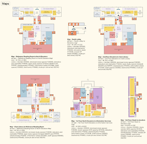
Color-coded map renderings of Hatcher Haunts floor plans and routes with accompanying documentation.
With a commitment to visual accessibility in mind, color never became the sole identifier for map landmarks. Icons and text allowed players to quickly identify areas, while color served as a tertiary aid. To guarantee inclusivity, color-blind filters were used to ensure that the starting location destination on map screens had proper color contrast.
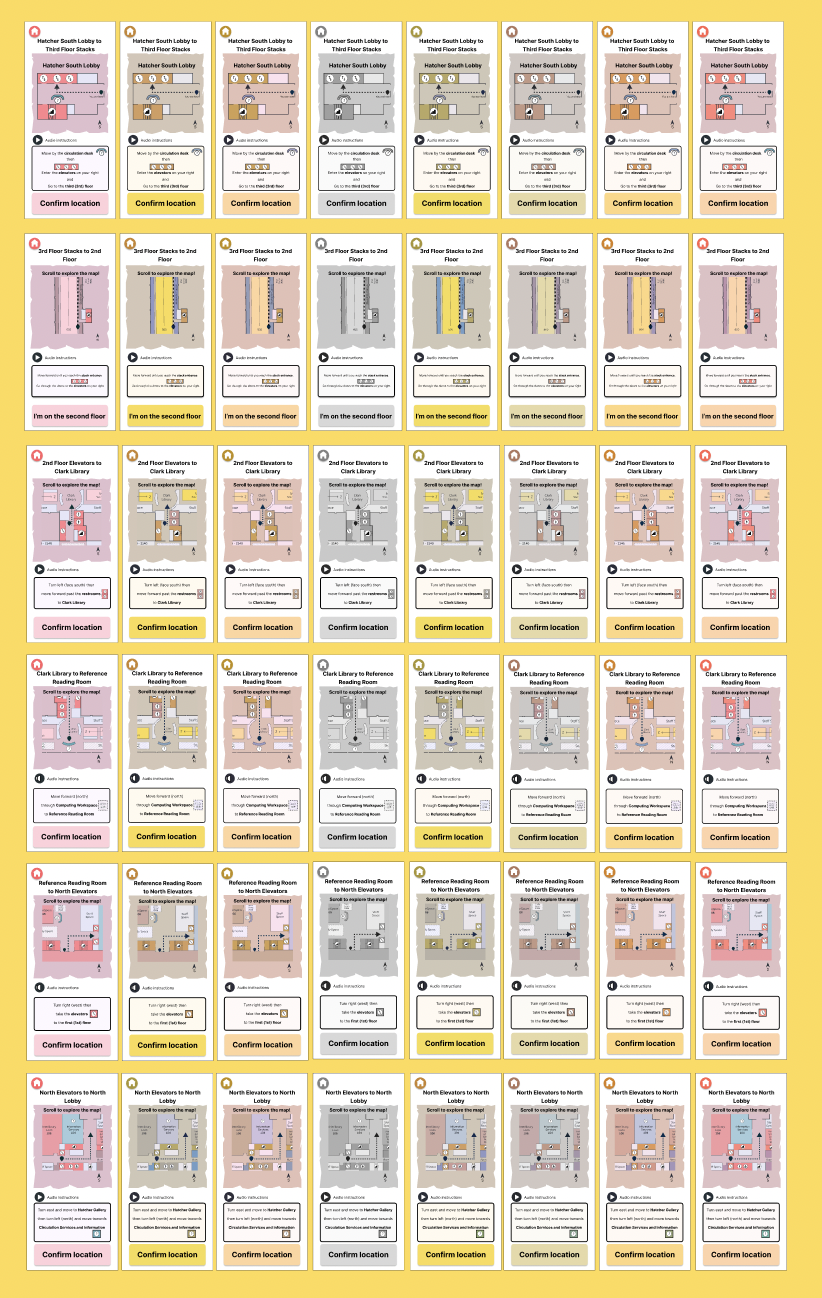
Hatcher Haunts map screens with color-blind filters applied to show color contrast.
After completion of the map files, our team began the wireframing and prototyping process. I initially felt very stressed about our timeline. We planned to finish the prototyping process in only three weeks, which felt very scary for us considering that we all had limited knowledge of Figma and prototyping in general. But our fears were quickly dispelled after finishing the low and mid-fidelity wireframes. By splitting up our game into groups of screens (e.g. map screens, tutorial screens, overlays, home/end screens, dialogue screens, quiz screens) we finished the drafts of our high-fidelity wireframes with time to spare! I focused my energy primarily on map screens and tutorial screens, as well as designing the study areas mini-game.
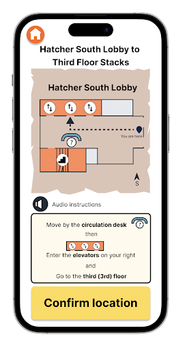
Hatcher South Lobby to Third Floor Stacks direction screen with visual, auditory, and written instructions.
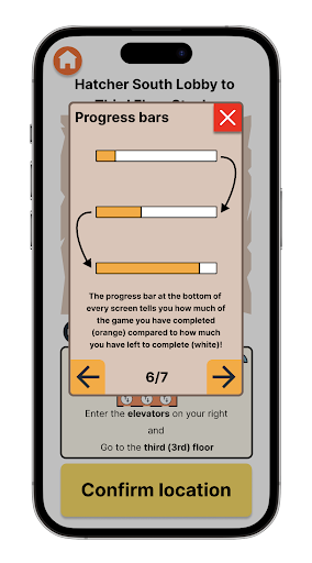
Tutorial overlay screen explaining game progress bars.
My biggest challenge during prototyping was standardizing our differing screen styles. Because we had split up the wireframing amongst the three of us, we ended up with very different margin standards, button designs, and color use. Thus, I spent a considerable amount of my time writing documentation for every component we used during gameplay so that we could standardize our elements and commit to certain norms for visual design and interactions.
Another very difficult moment during prototyping was the implementation of audio instructions on map screens. Figma does not support audio files, but I would not accept that as a limitation. Audio instructions would not only benefit students with visual impairments but non-native English speakers as well. I was able to come up with a lengthy workaround where we converted the audio instructions into MP4 video files, uploaded them to Figma, and finally hid them behind our audio buttons so you couldn’t see the video but could still hear the audio. This solution required a lot of experimentation and out-of-the-box thinking since I was unable to find answers from Figma help forums or online tutorials.
During the usability testing phase of this project, I learned how to facilitate playtests, interview players about their experiences in a non-biased way, and quantify qualitative data. Finding patterns in player responses and actions satisfied me, as I have always enjoyed trend-finding and statistical analysis. One of the biggest surprises during usability testing was that one of our playtesters had a visual impairment that affected her ability to read our dialogue screens properly. This experience fueled my passion for increasing accessibility in video games, and especially in Hatcher Haunts, as I realized that our work could present real barriers to individuals with disabilities that negatively impact their ability to participate in gameplay.
My greatest learning moment arrived while writing a full-scale accessibility report for Hatcher Haunts. I used the Web Content Accessibility Guidelines (WCAG) and the Game Accessibility Guidelines (GAG) to evaluate our screens for motor, cognitive, visual, and auditory inclusivity. Before starting this internship, I had a great interest in (but little applicable knowledge of) accessibility guidelines. Through working on Hatcher Haunts I was able to learn more about ADA law, industry standards, and levels of accessibility. The full report can be found here.
I’m so happy to have had the opportunity to be a Michigan Library Scholar and contribute to a project that I am passionate about. I truly hope that Hatcher Haunts continues to be developed beyond this internship and that all students, regardless of familiarity or ability, become frequent library visitors.