There is something wonderfully serendipitous about browsing the shelf, whether you’re in a grocery store, a bookstore, or a library. Browsing lets you find that item that is just adjacent to the one you thought you wanted, but may be even better or may spark ideas that take you in a new direction. Our Catalog Search full record view now shows a virtual shelf view of the book you are looking at so that you can peruse titles that would be shelved nearby. What’s better is that you can see across all the books in our collection, whether they are shelved in the same building or at other locations, including one of our remote storage facilities.
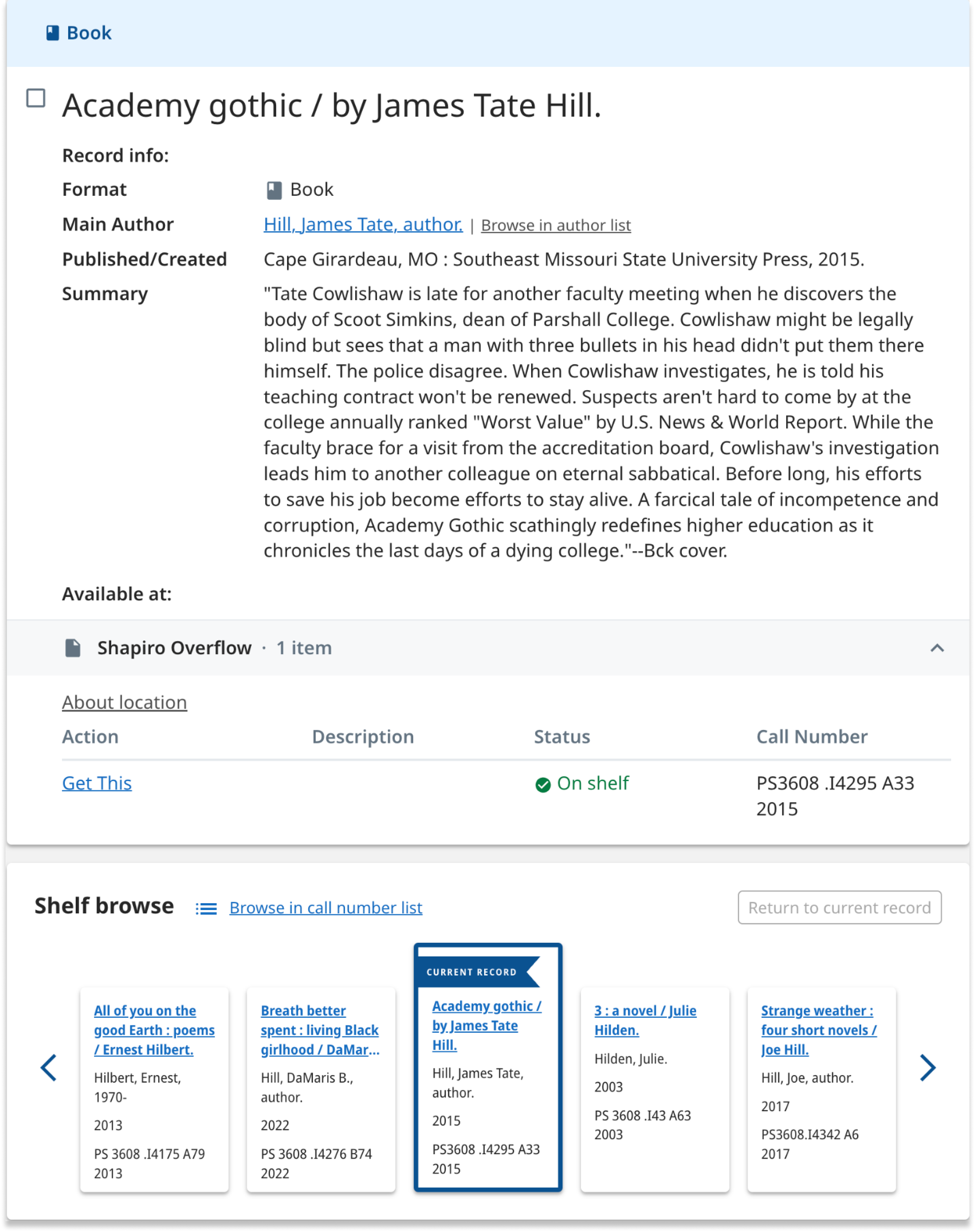
Figure 1. Sample catalog record showing metadata and the nearby on shelf carousel. Note that the full catalog record shows all this record’s metadata, which is truncated here.
How we built it
In some ways, we had already done the hard work of building a browseable call number view of our collections. Call number browse, launched a year ago, provides a unified shelf view of all items in our collection that have either Library of Congress (LC) or Dewey Decimal (Dewey) call numbers. Typically, books (whether print or electronic) are given call numbers during cataloging, while most other item types, such as journals, videos, music, microforms, etc., are not typically assigned call numbers.
Because we had already developed a process to order our items by call number, making the user interface for shelf browse within our catalog records was fairly straightforward. We needed to add an API to our call number index that would provide a list of books shelved to the left and right of the book marking the starting point. From there, you can scroll in either direction to see adjacent items, and go to the full call number browse index to go beyond the 20 items left or right of the starting point.
User research, testing, and design
As a part of user research understanding user needs around our catalog browse tool in August 2021, we showed library staff and other advanced users tools that featured a shelf browse feature. Additionally, we created and showed initial designs for how this feature could look in our library catalog. Many people were excited about the prospect of a shelf browse feature of our own and they commented how valuable it would be for students, faculty and library staff if it were added to our library catalog.
Fast forward to this February and March, when we were able to revisit and refine our designs. One of our key questions was: What information would we prioritize and display in the small card in the shelf browse? Our design was informed by the key insights from a survey and conversations with library staff, who helped us understand what information was most valuable to them when browsing for items. Initial designs contained assumptions from our team, on which we gathered feedback and iterated.
For example, we included a decorative image with each item in the first designs we shared (figure 2), but discovered through a brief survey that respondents would prefer having images that either showed actual book covers for each item or showed no image at all, rather than something decorative but not informative.
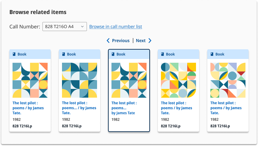
Figure 2: Our initial design
Final design
We ended up with the following information about each book (figure 3), displayed in a semi-condensed font to include as much information as possible in a small space while preserving readability:
- Title
- Author
- Publication year
- Call number
After determining what content to include for each record, we pivoted to experimenting with the interaction design of this feature, focusing on how users would navigate between pages of records and how they could return to the original record after browsing. Our design was informed by research on other carousels on websites like Amazon, Target, Michigan State University Library’s search platform, and HOLLIS (Harvard University Library’s search platform).
These three key design choices aimed to make it easy for users to navigate Shelf Browse:
- We added a clear label and visual flair to the current record in the Shelf Browse carousel to help sighted users more easily identify where they were browsing on the virtual shelf in relation to the record they viewed first.
- We added a “Return to current record” button to help users reorient themselves after browsing multiple pages of related items on the virtual shelf.
- Each time a user clicks the right or left arrow, a new page of 5, 3 or 1 result(s) is displayed, depending on screen size. We chose this approach rather than only showing 1 new result for all screen sizes to decrease the number of clicks required to browse, particularly for desktop users, who made up 73% of all users in 2023.
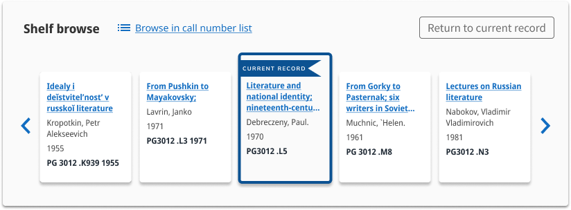
Figure 3. Our final design
We have also created custom web analytics to measure people’s clicks on different interactive elements in the shelf browse feature. These custom measures will help us evaluate and assess how this feature is used in relation to other interactions in library search.
Future development
The user testing we conducted during design and prior to launch indicated several areas for future improvement. Many librarians and students expressed a desire to see book covers in the catalog. Others emphasized the importance of having item titles shown in their original scripts (Chinese, Japanese, and Korean) rather than transliterated titles. And because our browse feature includes both print and electronic items, there was a desire to have the item’s format Indicated in the card in shelf browse. We’re excited to continue improving the shelf browse feature and the Library Search experience overall.