Emma Brown
Posts tagged with UX
Showing 1 - 10 of 13 items
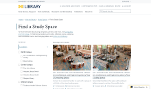
Find a Study Space is a brand new feature on the library website that launched in August 2025, improving our existing study space content and providing students with a new way to explore library study spaces. Learn about our research and design process and some of the key findings we discovered that informed the final product.

Reflections by Michigan Library Scholars intern Ayat Tolba on her 2025 project, which explored the experiences of first-generation international students and their engagement with U-M Library spaces, services, and resources.
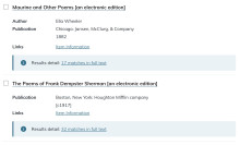
As user experience researchers and designers, it is our job to design better solutions for complex interfaces. Read on to learn our research and design process from discovering a usability issue to proposing solutions in collaboration with developers.
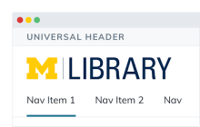
U-M Library’s universal header is the light gray bar at the top of the library website and Library Search that aims to help people recognize that they’re on a U-M Library website, and links to our different sites and services through the “Explore” menu. In the fall of 2020, the Design System Team conducted remote usability testing that helped us to understand people’s experiences and identify opportunities for improvement.

In three blog posts, the authors describe a multi-year library service design project. This last post describes the team’s prototyping and testing processes, and our resulting interactive exercise.

In three blog posts, the authors describe a multi-year library service design project. This second post describes the research process used to develop our user experience tool.
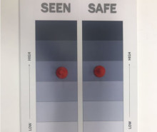
In three blog posts, the authors describe a multi-year library service design project. This first post describes the origins and goals of the assessment project.

How can we improve the familiarity and credibility between Library experts, resources and services we offer and the students, faculty and staff who use them? Whether we’re building new relationships or reconnecting with patrons/colleagues during assessment or user research activities, we have the opportunity to use certain marketing and communication best practices and tools during our user research to align clear and targeted communication with our key audiences.

The words we choose matter and having a shared vocabulary around user experience research is an important component of the work. This post presents definitions of user experience, user research, and usability testing, while examining how they intersect and why determining the frame of your research is good practice. Plus the one phrase we try not to use...
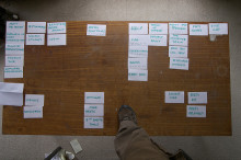
Everyone who works in the library, including some student workers, uses the intranet -- that’s over 450 people! In preparation for a major Drupal update and intranet redesign, the Intranet Upgrade Investigation Team (IUIT) has done a ton of thoughtful user research to guide our work including a survey, open card sort and closed cart sort. The findings are informing our progress and helping meet the goal of making the intranet a sustainable and user friendly tool that everyone wants to use.