Introduction
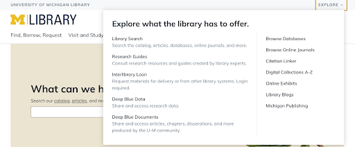
U-M Library’s universal header is the light gray bar at the top of the library website (lib.umich.edu) and Library Search (search.lib.umich.edu) that aims to help people recognize that they’re on a U-M Library website, and links to our different sites and services through the “Explore” menu.
Over time, we hope to expand placement of the universal header to more systems to link our many online services and tools, such as online exhibits or research guides.
In the fall of 2020, the Design System Team conducted remote usability testing for the universal header because we wanted to understand the following:
-
Do people notice it?
-
Does it help people recognize that they’re on a U-M Library website?
-
What do people think it does? Does it meet their expectations?
-
What do people expect to happen when they click on the “Explore” link?
-
Does it help users accomplish their goals that require using multiple U-M Library sites
Process and tools
For this research, we used a tool called Lookback, which offers moderated (synchronous) or unmoderated (asynchronous) usability testing. We allowed participants to choose either version. We wanted to make testing as convenient as possible since we were unable to offer incentives at the time (due to pandemic-related budget restrictions).
The test included a few simple tasks that aimed to lead participants from one library website to another. We wanted to see if people would use the universal header to navigate between sites. After completing the tasks, we asked a few targeted questions about the “Explore” menu in order to understand participants’ expectations and whether or not the menu met them.
We tried a few recruitment methods but had very low response rates. We believe this may have been due to a lack of incentives (again, due to pandemic-related budget restrictions). We recruited people from the Library Study Pool (a list of people who have signed up to participate in library-related user research) and from a list of people who had recently completed a survey on Library Search and said they were willing to be contacted again.
In total, we had nine participants. Six of these participants completed the moderated (synchronous) version of the test, while the other three completed the unmoderated (asynchronous) version of the test. In this group, we talked to two recent alumni, four graduate students, and three undergraduate students.
This test took about 20 minutes to complete, and participants were asked the following questions:
-
How do you know that this website is a library website? What specific elements of the site help you to know that?
-
The library provides a tool called “Citation Linker” that helps you find online articles by citation information. Can you try to find that tool from this webpage (started from Library Search)?
-
Notice the top of this page where it says “University of Michigan” and “Explore”. Before clicking on anything, what do you think this part of the page does? Why do you think it exists? What do you think the “Explore” label means?
-
Now, go ahead and click on “Explore”. Does this menu match up with your expectations? What do you think about this feature?
Findings
Once the nine interviews were complete, we took notes, looked for patterns, and assessed what we’d learned. We were happy to observe/learn the following:
-
8/9 participants referred to or interacted with the universal header without being directed to do so.
-
5/9 participants mentioned that the universal header helps them recognize that they’re on a U-M Library website.
-
6/9 participants felt like the “Explore” menu matched their expectations.
-
3/9 participants’ expectations for the “Explore” menu weren’t an exact match, but they still had a positive reaction after interacting with it.
-
4/9 participants used the “Explore” menu to navigate between library sites without being prompted.
We were excited to see that all but one participant referred to or interacted with the universal header without being asked to do so. This suggested that it was noticeable for our participants.
Through conducting interviews, we were able to hear how participants described the universal header in their own words:
-
“This feels pretty on point.”
-
“This looks very helpful, actually. This is what I would be looking for.”
-
“This is a pretty cool little tool.”
Opportunities for improvement
We also discovered opportunities for improvement. Four of nine participants expressed concern that the universal header might be overlooked. The styling of this component is pretty subtle (light gray background color and relatively thin). However, this is not necessarily a problem, as we do not want the universal header to overshadow a website’s global navigation (which refers to where the M|Library logo and primary navigation items appear).
We also learned that while people were content with what appeared in the “Explore” menu, it didn’t necessarily match their expectations. People expected to see everything from library hours, to links to other library sites (correct!), to interesting events and exhibits happening at the library. These diverse answers suggest that we may be able to come up with a stronger label that more closely aligns with the items that appear in the dropdown menu. We have not yet come up with a better alternative, but it is something that we will continue to consider.