I joined the Design & Discovery unit of the University of Michigan Library Information Technology department last October as a User Experience Specialist focused on content and information architecture. In these first six months, much of my work has focused on collaborating with library staff to find appropriate solutions to content related challenges and make the internal resources we provide for staff more effective. This all ultimately (hopefully!) trickles down to a better experience for our users.
Redesigning our staff intranet is a salient example of this kind of work. Everyone who works in the library, including some student workers, uses the intranet -- that’s over 450 people! Our intranet and public website are both built using the content management system Drupal, a robust, flexible and scalable open source platform. Drupal 8 was released in late 2015 and the intranet is still on Drupal 6. That said, the somewhat pressing need to upgrade is the primary driver behind the redesign, but we are also using it as an opportunity to make the tool a whole lot better. The Intranet Upgrade Investigation Team (IUIT), a group with membership from across the U-M Library, has done a ton of thoughtful user research to guide our work.
Staff Survey
In summer 2015, the IUIT conducted a brief, one-page survey to start getting feedback on the way the intranet works and features it offers. The survey was open to all librarians and library staff. Our goals were to understand what people find valuable and useful, as well as what needs improvement. Participants were asked to:
- Define the purpose of the intranet
- State how often they use the intranet
- Prioritize the existing navigation items
- Specify anything the intranet should provide that it currently doesn’t
- Indicate willingness to participate in user testing during the development phase
94 people completed the survey (a roughly 20% response rate) and the results were helpful in beginning to establish what users most value about the intranet and what the biggest pain points are.
Open Card Sort
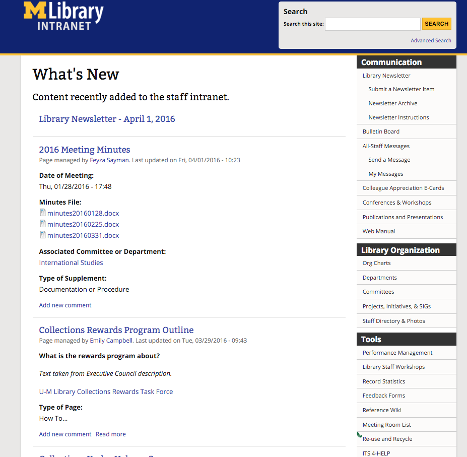
The current intranet yields the majority of homepage real estate to a “blog-style” feed of the most recent content activity with an extensive menu of around 40 links down the right sidebar. Many of the things available on the intranet are exposed in this menu (obviously), but it is overwhelming and some heavily used items, like HR forms, are difficult to find. The information architecture of the intranet is lacking, to say the least.

The U-M Library Intranet homepage currently features a feed of the most recent content and a menu that keeps going...and going. Capturing it in one screenshot is pretty much impossible.
We decided to employ card sorting to engage our users in considering what should be featured on the homepage and how the intranet as a whole should be organized. Eight users from around the library who indicated interest in helping with user testing as part of the survey participated in one-on-one open card sorts. In an open sort, participants organize terms into groups that make sense to them and then name those groups.
We included terms already used on the intranet and some potential new ones, all written on pieces of paper for participants to physically move around. Participants were asked to think out loud as they worked and members of the IUIT took notes on actions and things said. There was some agreement on where many of the terms belonged within the participant-defined groups generated during these sessions, but many structural questions remained and plenty of terms were placed in multiple groups. We decided to open the sort to the wider library in order to get meaningful data from a broader group of participants.
Closed Card Sort
The results of the open card sort allowed us to construct a well-informed online closed card sort with distinct categories in Qualtrics using the Pick, Group, and Rank question type. In a closed sort, the groups/categories are predetermined, which allows consistency and makes analysis much easier. Our predetermined categories were informed by the open sort findings, as well as efforts by the IUIT to remove duplicates and provide clarity. In addition to sorting items into categories, we also asked participants to think about the categories as real estate on the homepage and rank them by importance, plus we provided ample opportunities for open comments.
This activity was a bit of a time commitment (we estimated 30 minutes for completion), so we set a goal of a 10% response rate. We ended up with 59 completed surveys and beat our goal by almost 3%. The closed card sort results provided a tremendous amount of insight into users mental models of intranet content and the desire for simplification.
Some of What We're Planning
Based on all of this work, we started creating mockups of the new interface and investigating what functionality in Drupal 8 can help us accomplish our goals. We already have a number of distinct plans and could not have gotten to this point without user research and the participation of our awesome colleagues!
Things to watch for in the new intranet:
- Giving homepage real estate to the highest priority things we come to the intranet to do and find
- Adding the ability to favorite items and access them from the homepage
- Refining the number of content types to streamline content creation and improve flexibility
- Putting My Account in upper right
- Making Tools items action oriented (ex: Request an Online Exhibit, Access DataMart)
- Creating a far less confusing and cluttered interface
Everyone on the IUIT is excited about our progress and making the intranet a sustainable and user friendly tool that everyone wants to use.