Several months ago, the library’s Usability Working Group and User Experience Department completed a review of the way large academic libraries present combined search results on their web site. (See "A Look at Combined Search"). That review was the first phase in a process to help us revise the way we presented our combined search results with an end goal of deciding whether or not to include results from our article discovery environment in the mix with everything else.
As we looked at what our colleagues were doing and solicited feedback from library staff and library patrons, we realized that before we could contemplate adding another chunk of information to our search results, we needed to streamline what we already have. Therefore, we embarked on a redesign of the interface to give us room for new content and to improve the usability of what was being shown.
Google Analytics told us that most clicks to results were on the first 2 or 3 items in a result list; in some categories (such as our catalog) we were presenting up to 10 results. User feedback told us that we were not providing enough context for individual results to tell the user what they would get when they clicked. And just about everyone we asked noted that the results were presented in too small a font size for comfortable reading.
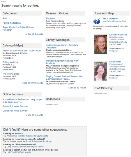
In response to this range of data and comments, we have revised the interface, giving more space to search results and drawing more attention to other sources of information for our site’s visitors. We have reduced the number of items in each section to a maximum of three, with more prominent "see all" links to get to all results for each category. (See screen shots at the bottom of this post -- or try it yourself from the library site.
We continue to present librarian subject specialists to match the search query in the right column, but have pulled out staff directory contacts to that column as well, removing them from the library web pages section. We have also added a new “Didn’t Find It?” section to the bottom center of the search results, inside of which are links to conduct the same search in ArticlesPlus (our Summon article discovery tool), Deep Blue (our institutional repository), and the HathiTrust. Links to subject-focused browse pages are also included here.
This redesign has put off the question of including ArticlesPlus results in the search results page, although we are likely to include them here now that there is space to do so. We are leaning this way for two reasons. First, because a review of search queries indicates that about a quarter of the searches conducted on our site would benefit from the inclusion of article-level results. Second, because of direct patron and staff queries requesting this feature.
New Search Results
Click for a full-size image.

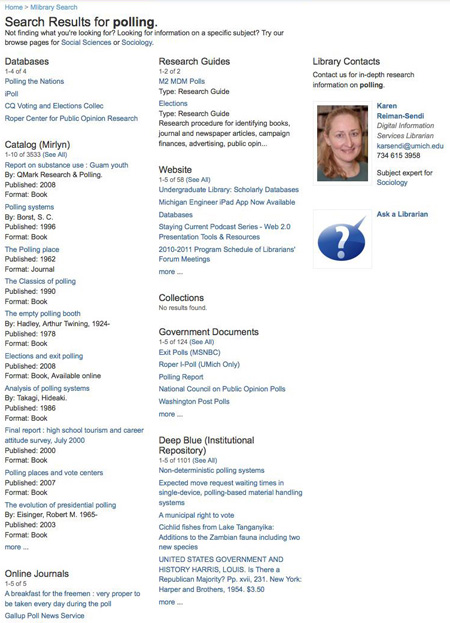
Original Search Results
