The University of Michigan Library’s website, like many others, has evolved organically to encompass a number of search interfaces. Our environment is perhaps more complicated than some, but shares some basic characteristics: multiple interfaces that allow users to find the content they need, built in different systems at different times. Over the past few years, Library IT’s Design & Discovery department has been working on improving this challenging user experience. We wrote about our initial planning in several blog posts in 2015: In Search Of... A Better Search Experience and The Next Mirlyn: More Than Just a Fresh Coat of Paint. In 2017, we have focused heavily on this project and we have now launched a public beta of our new, unified, search interface.
How We Got to Where We Are
We made a strategic decision in 2010 when we first licensed the ProQuest Summon discovery tool to keep our catalog and our article search interfaces separate. We felt then, and still do, that mixing licensed content with our (largely) physical collections was not in the best interest of our users. So, we offered two separate interfaces: Mirlyn (what we named our catalog in the 1980s) and ArticlesPlus (what we named our Summon interface in 2010). We also created a single search bento box style interface that includes separate results listings for those two sources, along with separate results listings for databases, online journals, and library web content. Add in yet another interface for our journal and database finders, and you have a hodgepodge of interfaces built in different systems over many years, with very little user experience consistency among them.
Our New Interface
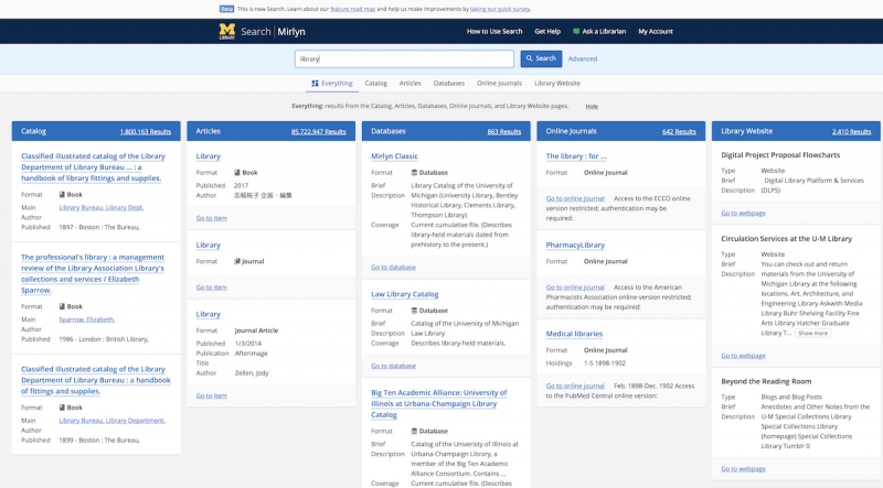
We feel that our 2010 decision, to keep the catalog and licensed content metadata separate, is still the right one for us. We also believe the “bento box” results list of our single search, in which each kind of result is presented separately, is the right way to introduce users to the breadth of our resources. Our new search interface combines the bento box of our current search with consistent individual search results pages for each kind of resource.
The starting point is the Everything search, which shows a small number of results from each of the search categories (Catalog, Articles, Databases, Journals, Website). If you know where you want to look in advance, you can switch to see a specific category of results by navigating the category groups either before you start your search. Or you can switch to a category after the “Everything” results display.

“Everything” Bento Box-Style Search Results
Within each of the categories, results are shown with filters on the left side of the screen, bringing needed consistency to our search interfaces. Access to items (for online items, a link to the resource itself; for physical items, a link to the appropriate request form) is available directly from the search results page or from each item’s full view.
Usability Testing Throughout
The current beta interface is the result of repeated cycles of usability testing and designing over the past year -- work that is still ongoing. We have tested the interface with paper prototypes, interactive visual prototypes built InVision, and (more recently) the site itself with undergraduate students, graduate students, and faculty. We have conducted many rounds of usability testing with volunteers from the University of Michigan’s Office of Services for Students with Disabilities and are very proud that our new search is highly accessible to those who make use of assistive technologies. We still have areas to improve, but the beta site already provides a significantly better user experience for users with disabilities than any of our current discovery interfaces.
The new search interface is also responsive and adapts itself to devices of varying screen sizes. Design & Discovery staff are currently testing the small-screen view of the interface, with improvements to layout planned in the coming months.
Continuing Development
The beta search interface is under ongoing development as we work on secondary features. It will remain in beta, with new features periodically being added, through the Winter 2018 semester. We anticipate this site will replace current Mirlyn, ArticlesPlus, Search Tools, and the MLibrary single search after the end of the Winter semester. Users will be able to enter searches from the “Search” area of the website (as they do now), or from the new search interface’s main page. A redesign of the library website itself, after search is complete, is in the planning stages.
Major features still in development include:
- Select and act on items -- The ability to select items in search results to share with others or generate citations.
- Service and Subject Experts -- Better display of librarians and staff who are experts in fields related to your search, to get individual help when you need it.
- Library Favorites -- An update to the Library Favorites tool that allows you to save search results for future use.
- Smart Results -- Recommended databases and journals based on your search, along with spelling correction and suggestions.
- Browse Online Journals and Databases -- The ability to browse by subject or alphabetically by name.
We want and appreciate user feedback on the beta version of our new search interface. When you see something you wish were different -- or like -- help us make improvements by taking our quick survey (or leave comments on this post).