When I had the chance to work on The Plain Language Medical Dictionary (PLMD), I was excited to contribute to a tool that bridges the gap between doctors and patients. The PLMD is an application that provides clear, easy to read and understand explanations of medical terminology. It is a cross-collaboration between HS-STEM and Design and Discovery (D&D) that was initially built as a PHP application in 2014 and later revised as a React application in 2020.
Scope of work
In 2023, we set out to update the Plain Language Medical Dictionary with three main goals:
- Add image support
- Update and add new terms to the PLMD
- Review and remediate any accessibility issues
I’m a front-end developer with Design and Discovery, and while I primarily focus on the main library website, I saw this project as an exciting chance to apply my front-end skills to a different tool with a familiar tech stack. Stepping into this project allowed me to bring fresh ideas while learning from a new set of challenges. Accessibility has always been a passion of mine, so I was especially excited to refine contrast, improve icons, and ensure images had proper alt text — small changes that make a big impact.
With the app’s old hosting environment on its way out, we needed a new solution. I helped migrate it to GitHub Pages and set up automated deployments with GitHub Actions, making future updates easier to manage. Beyond technical improvements, this update showcased the app’s potential to prospective HS-STEM grant sponsors and set the stage for potential future enhancements.
Baseline accessibility results
To kick off the project, the Digital Accessibility Team ran a baseline accessibility evaluation to identify areas that required improvement to meet accessibility standards. The team identified six key issues:
- Insufficient SVG contrast
- Placeholder text on inputs being used as a label
- Disabled page zooming
- Insufficient color contrast for link text
- Too small font size in various locations
- Lack of defined image role and on the search input image
Improving contrast, labels, and text size isn’t just about meeting standards — it’s about making sure ALL users can interact with the tool comfortably and on any device.
It’s important to note that these issues were identified using automated evaluation tools. These tools scan the page’s code and use algorithms to detect potential accessibility issues. While effective at catching many problems, automated tools are just one part of the accessibility evaluation process.
In addition to this automated process, I conducted a thorough evaluation of the user experience (UX) to identify further opportunities for improving accessibility. Given the limited scope of the project, I aimed to implement meaningful changes while keeping the updates minimal.
Accessibility Remediation and UX Improvements
Color Contrast
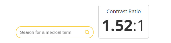
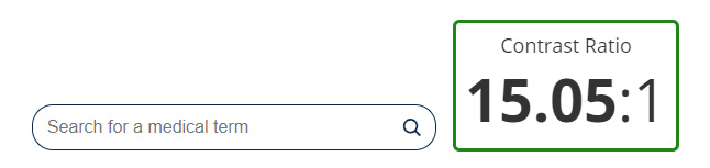
One of the most visible changes involved updating the color contrast of the search box at the top of the application. The Web Content Accessibility Guidelines (WCAG) require a minimum color contrast ratio of 4.5:1 to ensure the visibility of elements. The maize-on-white color scheme did not meet this standard. Simply changing the color from maize to blue addressed this issue.
Maize search input and color contrast ratio:
Blue search input and color contrast ratio:
Iconography
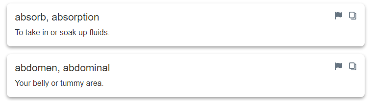
Another minor UX improvement involved updating the iconography used on individual search terms. Each term had an exclamation mark—often associated with warnings—that was used to allow users to report incorrect definitions.
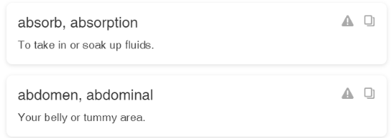
However, this icon could cause concern for users looking up medical symptoms. To avoid this, I replaced the exclamation mark with a less alarming flag icon. You may also notice the difference in contrast between the lighter icons in the images above, to the darker icons in the images below. Similar to the color contrast of the search input, this added contrast helped improve visibility of the elements.
I also added helper text throughout the application to guide users. For instance, instructions were added for the “search by paragraph” option to help clarify interaction and explain dynamic content within the interface.
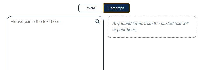
Image support
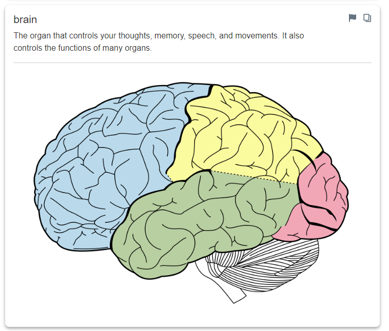
The primary goal of this update was to add image support to the application. Adding images enhances the application by providing visual aids that clarify complex or abstract terms, which can be difficult to explain with words alone.
Images help users who process information visually and can transcend language barriers, making medical terminology more accessible to non-native speakers and those from different cultural backgrounds.
Technical Solutions for Image Support
As stated previously, the scope of this update was intended to be minimal, so even though this is a rather unorthodox method of storing and retrieving data, I decided to stick with and build upon it. The data is also not sensitive so exposing it to the end-user does not pose any risks.
The application’s data is stored in a local JSON file, with each object containing a "term" and "definition." To support images, I added two new fields: "imgURL" and "altText." The "imgURL" field stores a path reference to locally hosted image files, while the "altText" field contains a description for screen readers, ensuring accessibility.
The image URL is a path reference to the image files, which are also all served up locally. The alt text is descriptive text read aloud by screen readers to convey the meaning of the image.
An early challenge I encountered was ensuring the images fit within the application’s layout. Since many images were sourced from third parties, it was difficult to find images with consistent sizing and aspect ratios to fit in our container.
Because of this, I wanted to make the images interactable to scale them to a larger view. I initially considered using a pop-up modal to expand images, but as I was building it out, I had concerns about this component not being accessible. It also became clear that the extra development time for making an interactive pop-up wouldn’t fit within our project scope. Instead, I opted for a simpler, more flexible solution–opening images in a new tab, leveraging default browser behavior.
Hosting update
Finally, we needed a new hosting solution for the PLMD, as our legacy hosting environment was being shut down in favor of more stable cloud hosting options. Given our priorities—reliability, ease of deployment, and minimal maintenance overhead—I explored several options before deciding on GitHub Pages.
Since the application code was already stored in a GitHub repository, GitHub Pages provided a seamless way to host the site without requiring additional infrastructure management. This solution allows us to serve the application directly from the repository, ensuring that any code updates automatically trigger a new deployment. Additionally, by leveraging GitHub Actions, I implemented a streamlined CI/CD workflow that runs tests and builds the project before deploying, improving overall stability and reducing manual intervention.
Conclusion
This project reinforced how even small accessibility improvements can make a big impact. At LIT and D&D, we’re always striving to enhance the accessibility of our applications, and I’m grateful to be part of a team that prioritizes this initiative.
I also gained a greater appreciation for balancing simplicity with functionality. Working on a smaller application like the PLMD highlighted how constraints can be a strength, forcing careful prioritization to maintain clarity and performance—lessons I can apply to the more complex Library website.
Finally, I learned the value of pragmatism. While modernizing the PLMD’s older codebase was tempting, it wouldn’t have benefited the end-user. Instead, staying focused on accessibility, UX, and image support ensured meaningful improvements. This experience reinforced that impact matters more than perfection.