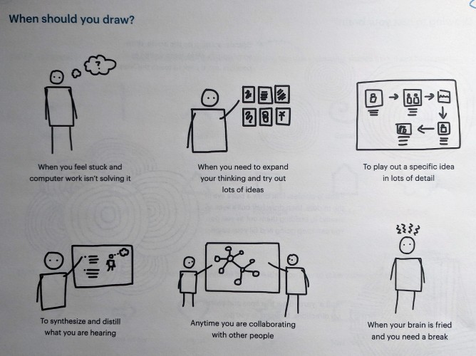
Unlike some of my peers at the Design Lab and in the School of Information, I am not by default a very visually-oriented person when it comes to thinking, learning, or expressing myself. In order to engage with this perspective a bit more, I decided to attend a Visual Thinking Seminar facilitated by a UMSI alumnus, Katie McCurdy. Specifically, the seminar was about “drawing for meaning” -- drawing as a thinking aid, a problem solving strategy, and a communication style. This was referred to as a “functional” drawing, as opposed to an artistic drawing.
Functional drawing was presented as a partial solution to two identified problems in the way we often work today: (1) Computer-only creativity, and (2) talking-only meetings. Problem (1) occurs because (in the context of design) computers are tools, and more specifically, precision tools. However, if you split the design process into a “defining” phase and a “refining” phase, the computer is often only apt for the latter due to its nature as a precision tool. When we use other tools, we generally already have a plan in place for how to accomplish the task we need that tool for. Why should we treat computers differently? Computers make it easy to start refining before we’re done defining by allowing us to get caught up in details. This argument makes a lot of sense to me, and looking back I can see some instances when I’ve wasted time tweaking configurations and technical details when I didn’t yet have a solid idea of what I wanted the final product to even look like! Problem (2) is a bit more obvious, and it’s easy to picture meetings where unaided verbal communication fails to result in everyone being on the same page, or even everyone being heard. In this context, drawing and other visual aids can help build common understanding and invite participation.

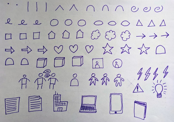
After some relaxing warm-up drawings, we started by practicing some easily identifiable shapes which were called a “Visual Alphabet.” These are easy-to-draw and distinct shapes that could be used in planning and diagrams. We then moved on to some ways to draw simple icon versions of commonly referred-to entities such as people, computers, documents and buildings.

My visual alphabet practice and a few of my icons
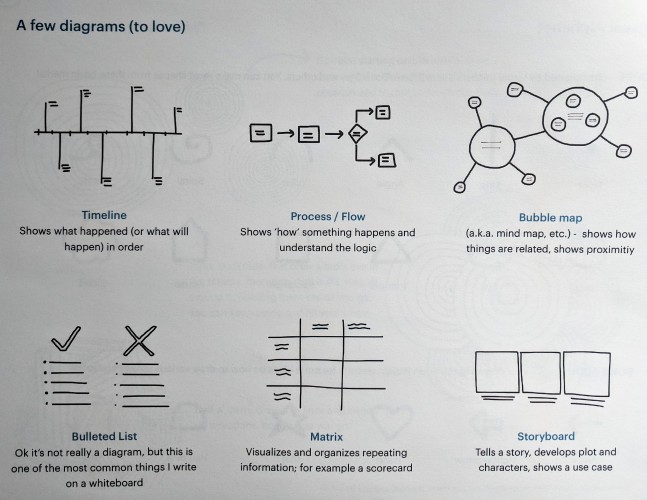
Next, we worked on some useful diagram types. A good choice of diagram should fit the information you are trying to organize or express in a way that feels natural and intuitive. After all, one of the goals of visual representation is to improve upon purely verbal or textual ways of expressing that same information. If a diagram is not assisting you in taking in, processing and understanding the information it is presenting, it is not really performing its duty as a diagram!

A few of the diagram types we covered
We then covered a few extra types of diagrams specifically meant to represent timelines, or processes over time. Katie talked about some of her work visualizing medical patient health histories, which I thought was pretty cool. Having a severe or chronic illness and going through hospital systems can be a tough and alienating process, and if visualization really does help patients conceptualize and communicate their experiences better, then I think we should be making use of that.
After trying some diagrams of our own, we wrapped up by going over a few tips: Making meetings visual (whether by drawing, whiteboarding, or presenting); using quiet individual brainstorming sessions before team discussions to ensure a wide range of ideas; keeping paper around to use functional drawing whenever it may be helpful; and putting up visual work where it can be seen and discussed. Overall, I thought this was a neat workshop and it convinced me that sometimes it may be helpful to step away from the computer and get out some paper instead.
Note: Ideas and pictures in this post heavily reference the Visual Thinking Seminar handout assembled by Katie. Her personal page, including information about her work and consulting, can be found here: http://katiemccurdy.com/