This semester I was fortunate enough to attend a conversation with architecture students on accessible design. The event focused on ways architects can articulate methods of accessibility, success or failures, through visual design. As an architecture student, it is great to see how people can visually start to diagram the world around us and highlight ways in which spaces can be more accessible in the future. The great thing about visual design is that it allows for people to see how these spaces are actually functioning. This also brings awareness to design issues that many people may see every day and simply not understand. My mother is in a wheelchair so as I explore spaces one of the first things that I consider is, would my mother be able to access this room? Not everyone has that direct relationship with someone that is disabled so they may not have that regular thought process. These design ideas then allow people to interact with these visual accessibility issues that they may see every day but not understand. Examples of this included: material ground changes as someone enters a new room/building, locations of elevators and restrooms, signage and placement of signage, as well as many others.
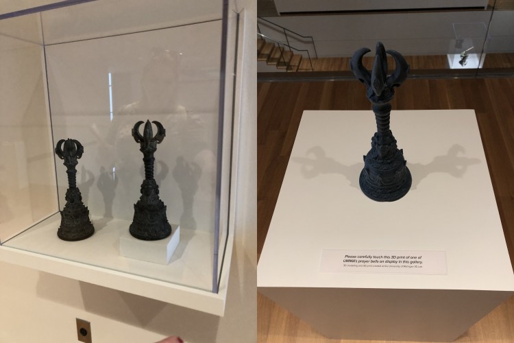
Attending this event then inspired me to look around at spaces on campus and begin to access how they can potentially be more accessible. To do this I decided to put my focus on the University of Michigan Museum of Art, UMMA. There I found an extremely accessible exhibit, images below, that included a 3D printed replica of the piece being displayed so that people could touch the object. All of the displays and text were at wheelchair height. The text font was a size that many people would be able to read from a distance. It was exciting to see people integrating accessible design ideas into the design of spaces at the university.

Prayer bells and 3D-printed replica. Photo by the author.