I've been researching mobile interface design for a few months now so when we got an email yesterday from a user asking if we'd consider making an iPhone interface for her favorite collection, I jumped at the opportunity. The collection she was interested in (the Bible: Revised Standard Version) is one of our oldest "legacy" collections. Luckily, the regular interface is very simple and doesn't contain any tables or even graphics. The main problem with viewing the text on an iPhone is that it basically displays a much smaller version of what you see on a full size monitor. The user must then zoom in to make the text big enough to read and then do lots of horizontal and vertical scrolling to read. Before:

So, in order to get the text to fill the allotted space and wrap nicely, all we had to do was simply add one meta tag into the <head> of the html. <meta name="viewport" content="width=device-width"> This basically tells the iPhone to display the content at the default size of the iPhone screen. Of course, "simple" is never just that. Because we aren't dealing with static html pages, collection manager extraordinaire Chris Powell had to spend some time trying to figure out how to insert the meta element, attributes, and attribute values & then figure out how to pass them to the CGI perl module. We have 2 other similar legacy collections, so we went ahead and made the same changes to them as well:
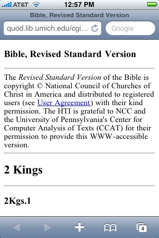
After:
Next on the agenda is to try this with one of the more complicated collections, or HathiTrust Digital Library using mobile specific style sheets.