About ten years ago, I wanted to paint my living room grey. As anyone who’s ever been to a hardware store knows, there are about one hundred different greys to choose from. I’ve always liked blues and greens, and have been less into warm colors, like reds and yellows, so I selected a grey on the cool side.
I bought the paint and applied it to my living room walls, only to find when I was finished that they looked blue! Not even really blueish grey, but just plain blue. I called my dad to explain the problem, and he answered with two words: simultaneous contrasts. The small amount of blue pigment in my grey paint was being emphasized by the orangey tones of the surrounding honey pine trim and woodwork in my house.
As the child of a color expert for a furniture company and an art professor, I was surprised to learn as an adult of this phenomenon. Now that I’ve finished my research for Behind the Curve: Rainbows and the Science and Culture of Color (May 2 - September 4, 2025 in the Hatcher Graduate Library Gallery Exhibit Room), I feel a little better knowing that for 1800 years of recorded history of color theory, no one else had heard of it either.
In the first half of the 19th century, however, a dye chemist at Gobelins, a textile manufacturer in France famous for its tapestries, finally began to uncover the impact that colors have when placed next to one another. Michel Eugène Chevreul (1786 – 1889) was attempting to address the irritations of the Gobelins weavers, who complained that the black fibers they were using looked muddy and muted in the final tapestry. He realized that it was the result of the black fibers and the colors surrounding them. If you’ve ever seen the optical illusion with a series of identical grey squares with different backgrounds that make the squares look totally different from one another – this is what Chevreul is talking about.
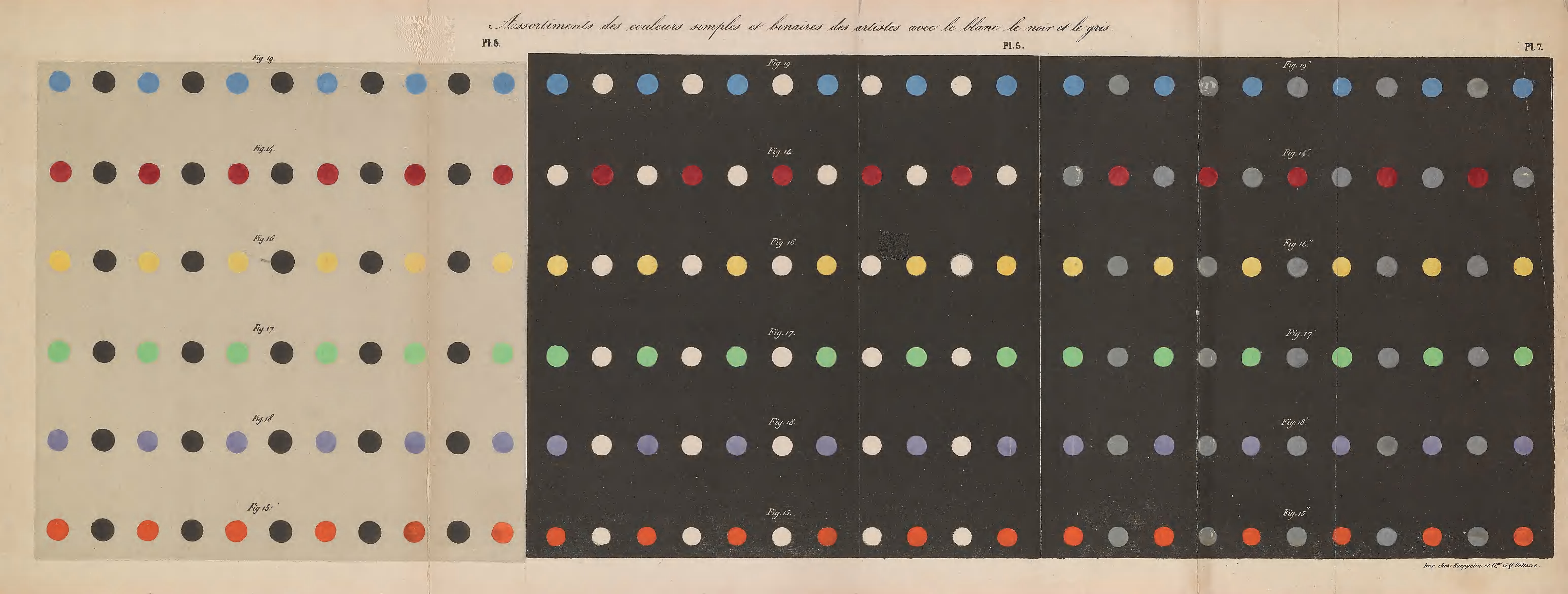
Chevreul, Michel Eugène. De la loi du contraste simultané des couleurs. Paris: Pitois-Levrault et ce, 1839.
In fact, in preparing the exhibit, I took a digitized version of Chevreul’s experiments and started to use it to create an advertisement. I used the eye dropper tool in Illustrator to grab the blue color from a series of dots arranged across the page. The dots were presented next to different colors and in front of different colored backgrounds. After trying one blue, I thought I might experiment with another. And then I remembered: they’re all the same blue! The eye dropper tool confirmed what my eye could not: the exact same shade can look wildly different depending on its surroundings.
Visitors to Behind the Curve can examine a fold out color plate with hand colored dots from Chevreul’s masterwork, De la loi du contraste simultané des couleurs (Paris: Pitois-Levrault et ce, 1839) alongside a work that it inspired the following decade, Jean François Persoz’s Traité théorique et pratique de l’impression des tissus (Paris : Victor Masson, 1846). Together, Chevreul and Persoz inspired a generation of artists, from Van Gogh to Seurat, as well as legendary textile designer William Morris.
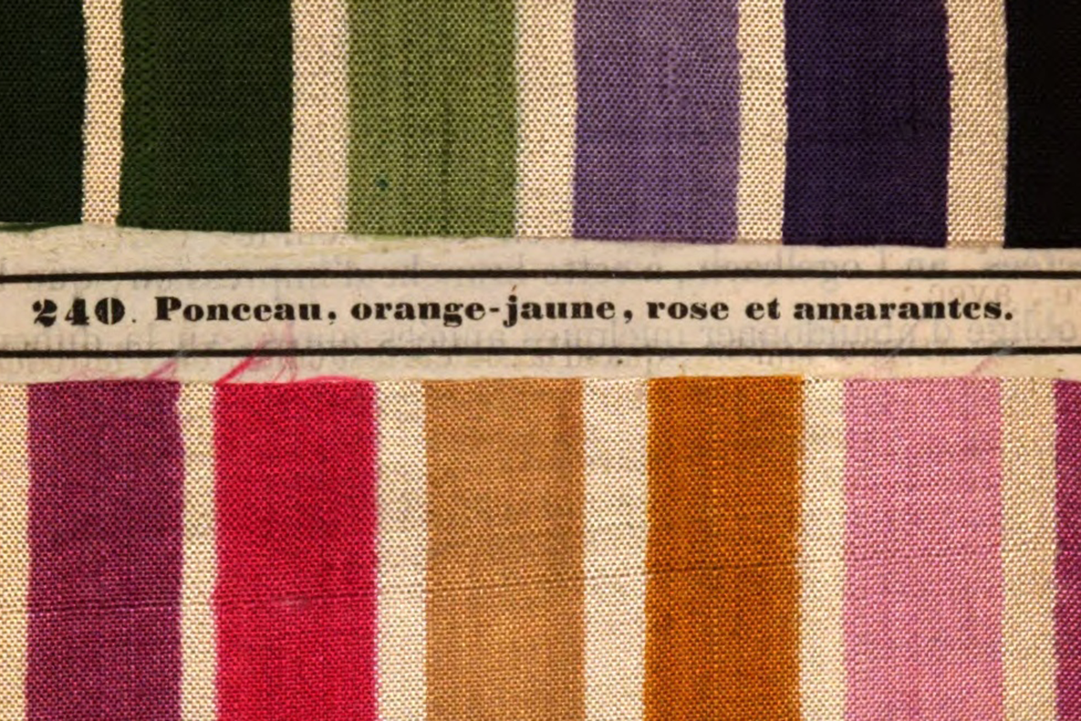
Fabric samples from Persoz, Jean François. Traité théorique et pratique de l’impression des tissus. Paris : Victor Masson, 1846.
Persoz’s work, part of a five volume set, includes many tipped in brightly colored textile samples that are luminously vibrant, despite being nearly 180 years old. While Chevreul set out to explain the science behind colors and their impact on one another, Persoz took Chevreul’s scientific claims and applied them to industrial textile production methods. We are lucky to have both of them at Michigan, and it is a delight to be able to share them via this exhibit this summer.
Behind the Curve: Rainbows and the Science and Culture of Color is on display May 2 - September 4, 2025 in the Hatcher Graduate Library Gallery Exhibit Room